Animated Glowing Inputs Login Form Using HTML & CSS
by Letscode - October 4,2023
Hello readers, Today in this blog you’ll learn how to create an Animated Glowing Inputs Login Form UI Design using only HTML & CSS. Previously I have shared an Amazing Transparent Login Form with HTML CSS & Javascript, now it’s time to create an Animated Glowing Inputs Login Form.
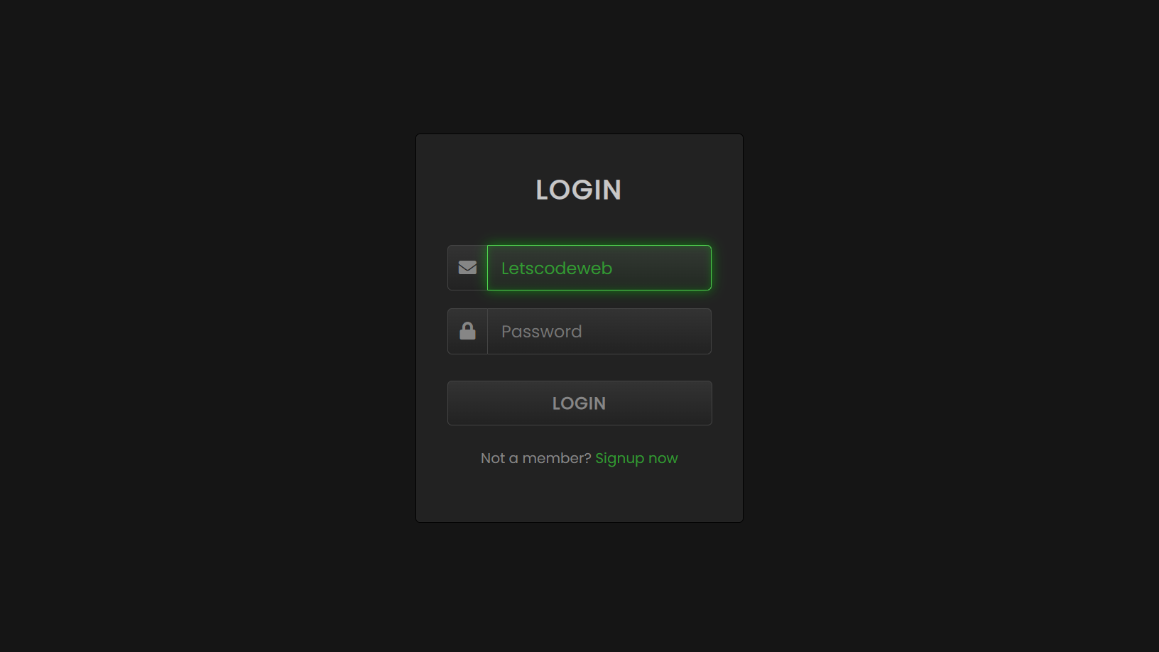
As you know, A Login form is used to enter authentication credentials to enter a restricted page or form. The login form holds a field for the username and another for the password. You can see in the image, this is an Animated Login Form with Glowing Effects in Input Fields.
Those input fields are in the initial stage where there are no glowing effects on the border. But when you click on the input field to enter some details, the borders of the input field start to glow.
Animated Login Form using only HTML & CSS [Source Codes]
To create this program (Animated Glowing Inputs Login Form). First, you need to create two Files one HTML File and another one is CSS File. After creating these files just paste the following codes in your file. First, create an HTML file with the name of index.html and paste the given codes in your HTML file. Remember, you’ve to create a file with .html extension.
First, create an HTML file with the name of index.html and paste the given codes in your HTML file. Remember, you’ve to create a file with .html extension.
<!DOCTYPE html>
<!-- Created By Letscodeweb -->
<html lang="en" dir="ltr">

<head>
    <meta charset="utf-8">
    <title>Glowing Inputs Login Form UI</title>
    <link rel="stylesheet" href="style.css">
    <link rel="stylesheet" href="https://cdnjs.cloudflare.com/ajax/libs/font-awesome/5.15.3/css/all.min.css" />
</head>

<body>
    <div class="login-form">
        <div class="text">
            LOGIN
        </div>
        <form>
            <div class="field">
                <div class="fas fa-envelope"></div>
                <input type="text" placeholder="Email or Phone">
            </div>
            <div class="field">
                <div class="fas fa-lock"></div>
                <input type="password" placeholder="Password">
            </div>
            <button>LOGIN</button>
            <div class="link">
                Not a member?
                <a href="#">Signup now</a>
            </div>
        </form>
    </div>
</body>

</html>
Second, create a CSS file with the name of style.css and paste the given codes in your CSS file. Remember, you’ve to create a file with .css extension.
@import url('https://fonts.googleapis.com/css?family=Poppins&display=swap');
*{
  margin: 0;
  padding: 0;
  font-family: 'Poppins',sans-serif;
}
body{
  display: flex;
  height: 100vh;
  text-align: center;
  align-items: center;
  justify-content: center;
  background: #151515;
}
.login-form{
  position: relative;
  width: 370px;
  height: auto;
  background: #1b1b1b;
  padding: 40px 35px 60px;
  box-sizing: border-box;
  border: 1px solid black;
  border-radius: 5px;
  box-shadow: inset 0 0 1px #272727;
}
.text{
  font-size: 30px;
  color: #c7c7c7;
  font-weight: 600;
  letter-spacing: 2px;
}
form{
  margin-top: 40px;
}
form .field{
  margin-top: 20px;
  display: flex;
}
.field .fas{
  height: 50px;
  width: 60px;
  color: #868686;
  font-size: 20px;
  line-height: 50px;
  border: 1px solid #444;
  border-right: none;
  border-radius: 5px 0 0 5px;
  background: linear-gradient(#333,#222);
}
.field input,form button{
  height: 50px;
  width: 100%;
  outline: none;
  font-size: 19px;
  color: #868686;
  padding: 0 15px;
  border-radius: 0 5px 5px 0;
  border: 1px solid #444;
  caret-color: #339933;
  background: linear-gradient(#333,#222);
}
input:focus{
  color: #339933;
  box-shadow: 0 0 5px rgba(0,255,0,.2),
              inset 0 0 5px rgba(0,255,0,.1);
  background: linear-gradient(#333933,#222922);
  animation: glow .8s ease-out infinite alternate;
}
@keyframes glow {
   0%{
    border-color: #339933;
    box-shadow: 0 0 5px rgba(0,255,0,.2),
                inset 0 0 5px rgba(0,0,0,.1);
  }
   100%{
    border-color: #6f6;
    box-shadow: 0 0 20px rgba(0,255,0,.6),
                inset 0 0 10px rgba(0,255,0,.4);
  }
}
button{
  margin-top: 30px;
  border-radius: 5px!important;
  font-weight: 600;
  letter-spacing: 1px;
  cursor: pointer;
}
button:hover{
  color: #339933;
  border: 1px solid #339933;
  box-shadow: 0 0 5px rgba(0,255,0,.3),
              0 0 10px rgba(0,255,0,.2),
              0 0 15px rgba(0,255,0,.1),
              0 2px 0 black;
}
.link{
  margin-top: 25px;
  color: #868686;
}
.link a{
  color: #339933;
  text-decoration: none;
}
.link a:hover{
  text-decoration: underline;
}
That’s all, now you’ve successfully created an Animated Glowing Inputs Login Form in HTML & CSS. If your code does not work or you’ve faced any error/problem then please comment down or contact us from the contact page.

Most Popular

Recent Posts
-
Image Slider in HTML CSS and JavaScript
Letscode - October 4,2023
-

Facebook Login Page Using HTML & CSS
Letscode - October 10,2023
-

Amazon Website clone in HTML & CSS
Letscode - November 4,2023
-
Custom Captcha Generator in HTML CSS and JS
Letscode - October 24,2023