Create Responsive Registration Form in HTML & CSS
by Letscode - October 15,2023
If you are looking for the Registration Form with a responsive feature and want to create it using basic HTML and CSS code then this blog can fill your demand.
In this blog, you will learn How to Create a Responsive Registration Form in HTML & CSS. Even if you are a complete beginner and have basic knowledge of HTML and CSS then also you will be able to create this Registration Form.
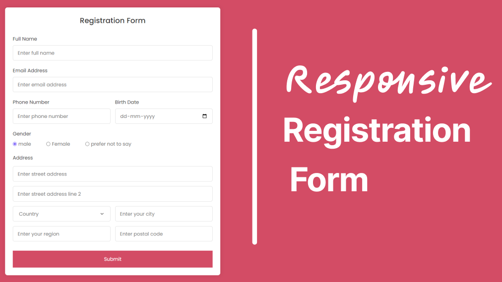
A Registration Form is a section on the website or an application where the user needs to fill in their details as required. The user detail like name, email, address, and others.
Have a look at the Registration Form preview that you are going to learn in this blog. As you can see I have added important input fields that every Registration must-have. And, also you can see some radio buttons to choose from and a submit button as well.
Registration Form in HTML & CSS [Source Code]
To create a Registration Form in HTML & CSS, follow the given steps line by line:
- Create a folder. You can name this folder whatever you want, and inside this folder, create the mentioned files.
- Create an index.html file. The file name must be index and its extension .html
- Create a style.css file. The file name must be style and its extension .css
- Create a script.js file. The file name must be script and its extension .js
Once you create these files, paste the given codes into the specified files. If you don’t want to do these then scroll down and download the Registration Form in HTML & CSS by clicking on the given download button.
First, paste the following codes into your index.html file.
<!DOCTYPE html>
<!---Coding By letscodeweb--->
<html lang="en">

<head>
    <meta charset="UTF-8" />
    <meta name="viewport" content="width=device-width, initial-scale=1.0" />
    <meta http-equiv="X-UA-Compatible" content="ie=edge" />
    <!--<title>Registration Form in HTML CSS</title>-->
    <!---Custom CSS File--->
    <link rel="stylesheet" href="style.css" />
</head>

<body>
    <section class="container">
        <header>Registration Form</header>
        <form action="#" class="form">
            <div class="input-box">
                <label>Full Name</label>
                <input type="text" placeholder="Enter full name" required />
            </div>

            <div class="input-box">
                <label>Email Address</label>
                <input type="text" placeholder="Enter email address" required />
            </div>

            <div class="column">
                <div class="input-box">
                    <label>Phone Number</label>
                    <input type="number" placeholder="Enter phone number" required />
                </div>
                <div class="input-box">
                    <label>Birth Date</label>
                    <input type="date" placeholder="Enter birth date" required />
                </div>
            </div>
            <div class="gender-box">
                <h3>Gender</h3>
                <div class="gender-option">
                    <div class="gender">
                        <input type="radio" id="check-male" name="gender" checked />
                        <label for="check-male">male</label>
                    </div>
                    <div class="gender">
                        <input type="radio" id="check-female" name="gender" />
                        <label for="check-female">Female</label>
                    </div>
                    <div class="gender">
                        <input type="radio" id="check-other" name="gender" />
                        <label for="check-other">prefer not to say</label>
                    </div>
                </div>
            </div>
            <div class="input-box address">
                <label>Address</label>
                <input type="text" placeholder="Enter street address" required />
                <input type="text" placeholder="Enter street address line 2" required />
                <div class="column">
                    <div class="select-box">
                        <select>
                            <option hidden>Country</option>
                            <option>America</option>
s                            <option>India</option>
                            <option>Gujarat</option>
                        </select>
                    </div>
                    <input type="text" placeholder="Enter your city" required />
                </div>
                <div class="column">
                    <input type="text" placeholder="Enter your region" required />
                    <input type="number" placeholder="Enter postal code" required />
                </div>
            </div>
            <button>Submit</button>
        </form>
    </section>
</body>

</html>
Second, paste the following codes into your style.css file.
/* Coding by Letscode */
/* Import Google font - Poppins */
@import url('https://fonts.googleapis.com/css2?family=Poppins:wght@400;500;600&display=swap');

* {
    margin: 0;
    padding: 0;
    box-sizing: border-box;
    font-family: "Poppins", sans-serif;
}

body {
    display: flex;
    align-items: center;
    justify-content: center;
    min-height: 100vh;
    background: #cf0b77fc;
}

.wrapper {
    width: 450px;
    overflow: hidden;
    padding: 28px;
    border-radius: 8px;
    background: #fff;
    box-shadow: 0 10px 25px rgba(0, 0, 0, 0.06);
}

.wrapper .pass-field {
    height: 65px;
    width: 100%;
    position: relative;
}

.pass-field input {
    width: 100%;
    height: 100%;
    outline: none;
    padding: 0 17px;
    font-size: 1.3rem;
    border-radius: 5px;
    border: 1px solid #999;
}

.pass-field input:focus {
    padding: 0 16px;
    border: 2px solid #4285F4;
}

.pass-field i {
    right: 18px;
    top: 50%;
    font-size: 1.2rem;
    color: #999;
    cursor: pointer;
    position: absolute;
    transform: translateY(-50%);
}

.wrapper .content {
    margin: 20px 0 10px;
}

.content p {
    color: #333;
    font-size: 1.3rem;
}

.content .requirement-list {
    margin-top: 20px;
}

.requirement-list li {
    font-size: 1.3rem;
    list-style: none;
    display: flex;
    align-items: center;
    margin-bottom: 15px;
}

.requirement-list li i {
    width: 20px;
    color: #aaa;
    font-size: 0.6rem;
}

.requirement-list li.valid i {
    font-size: 1.2rem;
    color: #4285F4;
}

.requirement-list li span {
    margin-left: 12px;
    color: #333;
}

.requirement-list li.valid span {
    color: #999;
}

@media screen and (max-width: 500px) {

    body,
    .wrapper {
        padding: 15px;
    }

    .wrapper .pass-field {
        height: 55px;
    }

    .pass-field input,
    .content p {
        font-size: 1.15rem;
    }

    .pass-field i,
    .requirement-list li {
        font-size: 1.1rem;
    }

    .requirement-list li span {
        margin-left: 7px;
    }
}
If you face any difficulties while creating your Registration Form or your code is not working as expected, you can download the source code files for this Registration Form for free by clicking on the download button, and you can also view a live demo of this card slider by clicking on the view live button.

Most Popular


Recent Posts
-
Image Slider in HTML CSS and JavaScript
Letscode - October 4,2023
-

Facebook Login Page Using HTML & CSS
Letscode - October 10,2023
-

Amazon Website clone in HTML & CSS
Letscode - November 4,2023
-

Custom Captcha Generator in HTML CSS and JS
Letscode - October 24,2023