Create A Beautiful Responsive Website in HTML and CSS
by Letscode - October 4,2023
In today’s age, having a basic understanding of web development can be incredibly useful. Whether you want to showcase your portfolio, start a blog, or just experiment with web design, creating a simple website homepage is a great place to start.
In this beginner-friendly post, I’ll guide you through the process of creating your first website homepage using HTML and CSS. You’ll learn how to build an interactive homepage featuring a navigation bar, place elements on the page, and style them to make your website visually appealing and engaging.
To create a responsive website homepage, we will use commonly used HTML elements like div, h2, h1, and button, as well as basic CSS properties. This project is beginner-friendly, so you should have no trouble following along.
Steps to Create Website Homepage HTML & CSS
To create a responsive website homepage using HTML and CSS, follow these simple step-by-step instructions:
- First, create a folder with any name you like. Then, make the necessary files inside it.
- Create a file called index.html to serve as the main file.
- Create a file called style.css for the CSS code.
To start, add the following HTML codes to your index.html file: This code includes essential HTML markup with different semantic tags like header, nav, h2, div, p, ul, li, buttons, etc. to create a website homepage.
<!DOCTYPE html>
<!-- Coding By LetsCodeweb - -->
<html lang="en">
<head>
<meta charset="UTF-8" />
<meta name="viewport" content="width=device-width, initial-scale=1.0" />
<title>Responsive Website Homepage HTML and CSS | LetsCodeweb</title>
<link rel="stylesheet" href="style.css" />
</head>
<body>
<header class="header">
<nav class="navbar">
<h2 class="logo"><a href="#">LetsCode</a></h2>
<input type="checkbox" id="menu-toggle" />
<label for="menu-toggle" id="hamburger-btn">
<svg xmlns="http://www.w3.org/2000/svg" height="24" viewBox="0 0 24 24" width="24">
<path d="M3 12h18M3 6h18M3 18h18" stroke="currentColor" stroke-width="2" stroke-linecap="round" />
</svg>
</label>
<ul class="links">
<li><a href="#">Home</a></li>
<li><a href="#">About Us</a></li>
<li><a href="#">Services</a></li>
<li><a href="#">Portfolio</a></li>
<li><a href="#">Contact Us</a></li>
</ul>
<div class="buttons">
<a href="#" class="signin">Sign In</a>
<a href="#" class="signup">Sign Up</a>
</div>
</nav>
</header>
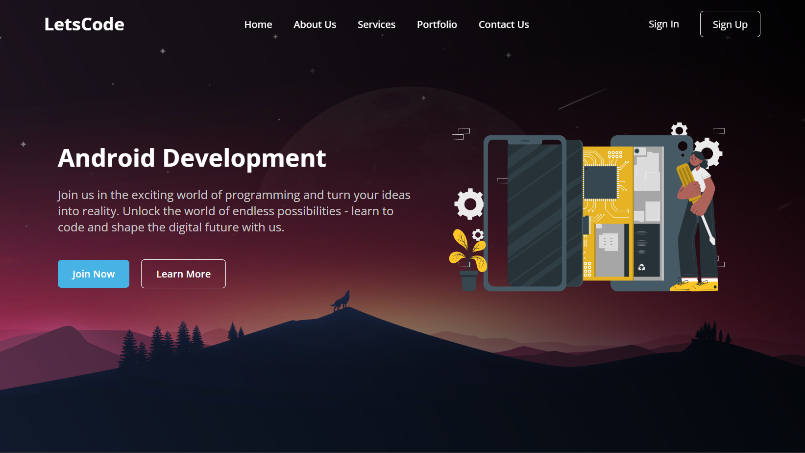
<section class="hero-section">
<div class="hero">
<h2>Android Development</h2>
<p>
Join us in the exciting world of programming and turn your ideas into
reality. Unlock the world of endless possibilities - learn to code and
shape the digital future with us.
</p>
<div class="buttons">
<a href="#" class="join">Join Now</a>
<a href="#" class="learn">Learn More</a>
</div>
</div>
<div class="img">
<img src="/Responsive-Website-HTML-CSS/Product teardown-cuate.png" alt="hero image" />
</div>
</section>
</body>
</html>
Next, add the following CSS codes to your style.css file to apply visual styling to the homepage, like color, font, background, etc. After that, you can view your attractive and responsive website homepage by loading the web page in your browser.
/* Coding by Letscode */
/* Importing Google font - Open Sans */
@import url("https://fonts.googleapis.com/css2?family=Open+Sans:wght@300;400;500;600;700&display=swap");

* {
    margin: 0;
    padding: 0;
    box-sizing: border-box;
    font-family: "Open Sans", sans-serif;
}

body {
    height: 100vh;
    width: 100%;
    background: linear-gradient(-120deg,rgba(0, 0, 0, 0.991), rgba(0, 0, 0, 0.068)), url(/Responsive-Website-HTML-CSS/hero.jpg);
    background-position: center;
    background-size: cover;
}

.header {
    position: fixed;
    top: 0;
    left: 0;
    width: 100%;
}

.navbar {
    display: flex;
    align-items: center;
    justify-content: space-between;
    max-width: 1200px;
    margin: 0 auto;
    padding: 20px 15px;
}

.navbar .logo a {
    font-size: 1.8rem;
    text-decoration: none;
    color: #fff;
}

.navbar .links {
    display: flex;
    align-items: center;
    list-style: none;
    gap: 35px;
}

.navbar .links a {
    font-weight: 500;
    text-decoration: none;
    color: #fff;
    padding: 10px 0;
    transition: 0.2s ease;
}

.navbar .links a:hover {
    color: #47b2e4;
}

.navbar .buttons a {
    text-decoration: none;
    color: #fff;
    font-size: 1rem;
    padding: 15px 0;
    transition: 0.2s ease;
}

.navbar .buttons a:not(:last-child) {
    margin-right: 30px;
}

.navbar .buttons .signin:hover {
    color: #47b2e4;
}

.navbar .buttons .signup {
    border: 1px solid #fff;
    padding: 10px 20px;
    border-radius: 0.375rem;
    text-align: center;
    transition: 0.2s ease;
}

.navbar .buttons .signup:hover {
    background-color: #47b2e4;
    color: #fff;
}

.hero-section {
    display: flex;
    justify-content: space-evenly;
    align-items: center;
    height: 95vh;
    padding: 0 15px;
    max-width: 1200px;
    margin: 0 auto;
}

.hero-section .hero {
    max-width: 50%;
    color: #fff;
}

.hero h2 {
    font-size: 2.5rem;
    margin-bottom: 20px;
}

.hero p {
    font-size: 1.2rem;
    margin-bottom: 20px;
    color: #c9c7c7;
}

.hero-section .img img {
    width: 517px;
}

.hero-section .buttons {
    margin-top: 40px;
}

.hero-section .buttons a {
    text-decoration: none;
    color: #fff;
    padding: 12px 24px;
    border-radius: 0.375rem;
    font-weight: 600;
    transition: 0.2s ease;
    display: inline-block;
}

.hero-section .buttons a:not(:last-child) {
    margin-right: 15px;
}

.buttons .join {
    background-color: #47b2e4;
}

.hero-section .buttons .learn {
    border: 1px solid #fff;
    border-radius: 0.375rem;
}

.hero-section .buttons a:hover {
    background-color: #47b2e4;
}

/* Hamburger menu styles */
#menu-toggle {
    display: none;
}

#hamburger-btn {
    font-size: 1.8rem;
    color: #fff;
    cursor: pointer;
    display: none;
    order: 1;
}

@media screen and (max-width: 1023px) {
    .navbar .logo a {
        font-size: 1.5rem;
    }

    .links {
        position: fixed;
        left: -100%;
        top: 75px;
        width: 100%;
        height: 100vh;
        padding-top: 50px;
        background: linear-gradient(to bottom, #163338 23%, #000 95%);
        flex-direction: column;
        transition: 0.3s ease;
    }

    .navbar #menu-toggle:checked~.links {
        left: 0;
    }

    .navbar #hamburger-btn {
        display: block;
    }

    .header .buttons {
        display: none;
    }

    .hero-section .hero {
        max-width: 100%;
        text-align: center;
    }

    .hero-section img {
        display: none;
    }
}
Conclusion and Final Words
In conclusion, creating a website homepage is a simple but valuable project for a beginner web developer. I believe that by following the steps in this post, you’ve successfully created your very first responsive website homepage using HTML and CSS.
Remember to experiment and customize your website to add personal touches and make it even more beautiful. To continue improving your HTML and CSS skills, why not try recreating other attractive website designs available on this website? These designs are not limited to simple homepage designs but also include complete website designs.
If you encounter any problems while creating your website homepage, you can download the source code files for this homepage project for free by clicking the Download button. Additionally, you can view a live demo of it by clicking the View Live button.

Most Popular
Recent Posts
-
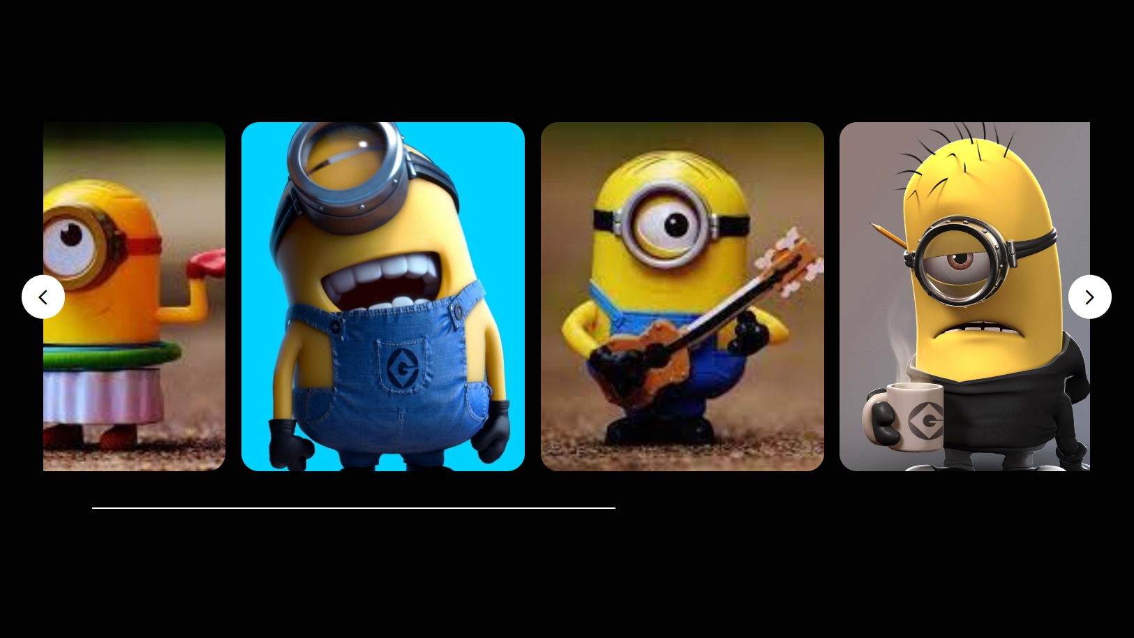
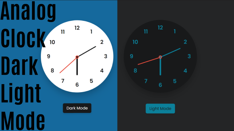
Image Slider in HTML CSS and JavaScript
Letscode - October 4,2023
-
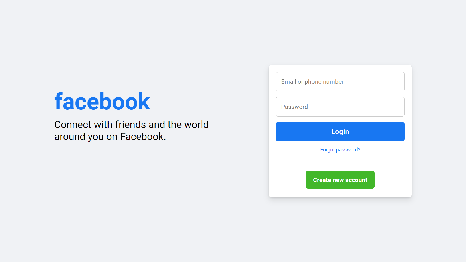
Facebook Login Page Using HTML & CSS
Letscode - October 10,2023
-
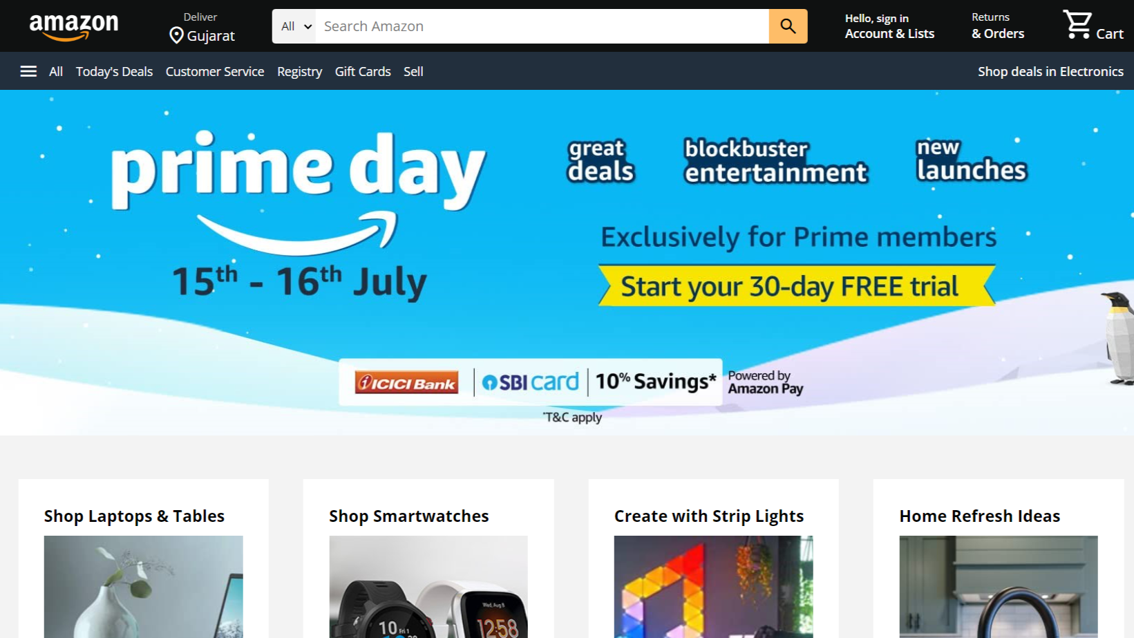
Amazon Website clone in HTML & CSS
Letscode - November 4,2023
-
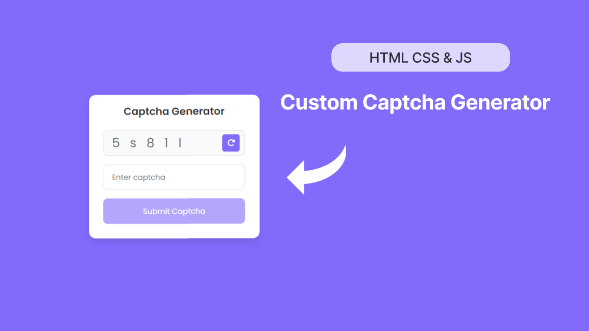
Custom Captcha Generator in HTML CSS and JS
Letscode - October 24,2023