Create A Responsive Image Slider in HTML CSS and JavaScript
by Letscode - October 4,2023
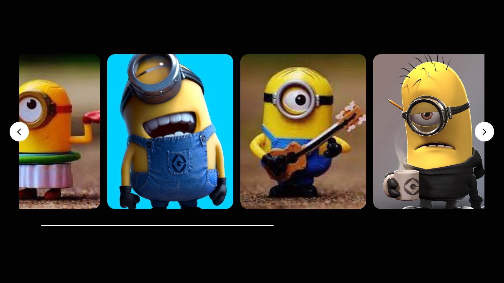
Image sliders have become an important component of websites, used to showcase multiple images in an engaging way. As a beginner web developer, creating an image slider can be a useful project to understand and improve your fundamental web development concepts, such as responsive designs, DOM manipulation, and JavaScript event listeners.
In this blog post, I will show you how to create a responsive image slider using HTML, CSS, and JavaScript. We will use vanilla JavaScript to create this slider without relying on external JavaScript libraries such as SwiperJs or Owl Carousel. This way, beginners can learn how these image sliders work and the code required to build them.
In this image slider, there are two buttons for sliding images: one for going back and one for moving forward. There is also a horizontal scrollbar that acts as a slider indicator and can be used to slide images by dragging it. This slider supports all major browsers like Chrome, Firefox, and Edge, as well as mobile or tablet devices.
Steps to Create Image Slider in HTML & JavaScript
To create a responsive image slider using HTML, CSS, and vanilla JavaScript, follow these simple step-by-step instructions:
- First, create a folder with any name you like. Then, make the necessary files inside it.
- Create a file called index.html to serve as the main file.
- Create a file called style.css for the CSS code.
- Create a file called script.js for the JavaScript code.
- Finally, download the Images folder and put it in your project directory. This folder contains all the images you’ll need for this image slider. You can also use your own images.
To start, add the following HTML codes to your index.html file. These codes include all essential HTML semantic tags, such as div, button, img, etc., for the image slider.
<!DOCTYPE html>
<!-- Coding By letscodeweb -->
<html lang="en">

<head>
    <meta charset="UTF-8" />
    <meta name="viewport" content="width=device-width, initial-scale=1.0" />
    <title>Image Slider in HTML CSS and JavaScript | Let'scode</title>
    <!-- Google Fonts Link For Icons -->
    <link rel="stylesheet"
        href="https://fonts.googleapis.com/css2?family=Material+Symbols+Rounded:opsz,wght,FILL,GRAD@48,400,0,0" />
    <link rel="stylesheet" href="style.css" />
    <script src="script.js" defer></script>
</head>

<body>
    <div class="container">
        <div class="slider-wrapper">
            <button id="prev-slide" class="slide-button material-symbols-rounded">
                chevron_left
            </button>
            <ul class="image-list">
                <img class="image-item" src="/Custom-Slider/slider (1).jpeg" alt="img-1" />
                <img class="image-item" src="/Custom-Slider/slider (1).jpg" alt="img-2" />
                <img class="image-item" src="/Custom-Slider/slider (2).jpeg" alt="img-3" />
                <img class="image-item" src="/Custom-Slider/slider (2).jpg" alt="img-4" />
                <img class="image-item" src="/Custom-Slider/slider (3).jpg" alt="img-5" />
                <img class="image-item" src="/Custom-Slider/slider (4).jpg" alt="img-6" />
                <img class="image-item" src="/Custom-Slider/slider (5).jpg" alt="img-7" />
            </ul>
            <button id="next-slide" class="slide-button material-symbols-rounded">
                chevron_right
            </button>
        </div>
        <div class="slider-scrollbar">
            <div class="scrollbar-track">
                <div class="scrollbar-thumb"></div>
            </div>
        </div>
    </div>
</body>

</html>
Next, add the following CSS codes to your style.css file to make your image slider beautiful. You can experiment with different CSS properties like colors, fonts, and backgrounds to give a personalized touch to your slider. If you load the web page in your browser, you can see your image slider with a scrollbar and an arrow button.
/* Coding by Letscode */
* {
    margin: 0;
    padding: 0;
    box-sizing: border-box;
}

body {
    display: flex;
    align-items: center;
    justify-content: center;
    min-height: 100vh;
    background: #010101;
}

.container {
    max-width: 1200px;
    width: 95%;
}

.slider-wrapper {
    position: relative;
}

.slider-wrapper .slide-button {
    position: absolute;
    top: 50%;
    outline: none;
    border: none;
    height: 50px;
    width: 50px;
    z-index: 5;
    color: #000;
    display: flex;
    cursor: pointer;
    font-size: 2.2rem;
    background: #fff;
    align-items: center;
    justify-content: center;
    border-radius: 50%;
    transform: translateY(-50%);
}

.slider-wrapper .slide-button:hover {
    background: #999;
}

.slider-wrapper .slide-button#prev-slide {
    left: -25px;
    display: none;

}

.slider-wrapper .slide-button#next-slide {
    right: -25px;
}

.slider-wrapper .image-list {
    display: grid;
    grid-template-columns: repeat(10, 1fr);
    gap: 18px;
    font-size: 0;
    list-style: none;
    margin-bottom: 30px;
    overflow-x: auto;
    scrollbar-width: none;
}

.slider-wrapper .image-list::-webkit-scrollbar {
    display: none;
}

.slider-wrapper .image-list .image-item {
    width: 325px;
    height: 400px;
    object-fit: cover;
}

.image-list img {
    border-radius: 20px;
}

.container .slider-scrollbar {
    height: 24px;
    width: 100%;
    display: flex;
    align-items: center;
}

.slider-scrollbar .scrollbar-track {
    background: #000;
    width: 100%;
    height: 2px;
    display: flex;
    align-items: center;
    border-radius: 4px;
    position: relative;
}

.slider-scrollbar:hover .scrollbar-track {
    height: 4px;
}

.slider-scrollbar .scrollbar-thumb {
    position: absolute;
    background: #fff;
    top: 0;
    bottom: 0;
    width: 50%;
    height: 100%;
    cursor: grab;
    border-radius: inherit;
}

.slider-scrollbar .scrollbar-thumb:active {
    cursor: grabbing;
    height: 8px;
    top: -2px;
}

.slider-scrollbar .scrollbar-thumb::after {
    content: "";
    position: absolute;
    left: 0;
    right: 0;
    top: -10px;
    bottom: -10px;
}

/* Styles for mobile and tablets */
@media only screen and (max-width: 1023px) {
    .slider-wrapper .slide-button {
        display: none !important;
    }

    .slider-wrapper .image-list {
        gap: 10px;
        margin-bottom: 15px;
        scroll-snap-type: x mandatory;
    }

    .slider-wrapper .image-list .image-item {
        width: 280px;
        height: 380px;
    }

    .slider-scrollbar .scrollbar-thumb {
        width: 20%;
    }
}
Finally, add the following JavaScript code to your script.js file to make the to generate random captcha and validated our entered captcha.
const initSlider = () => {
    const imageList = document.querySelector(".slider-wrapper .image-list");
    const slideButtons = document.querySelectorAll(".slider-wrapper .slide-button");
    const sliderScrollbar = document.querySelector(".container .slider-scrollbar");
    const scrollbarThumb = sliderScrollbar.querySelector(".scrollbar-thumb");
    const maxScrollLeft = imageList.scrollWidth - imageList.clientWidth;

    // Handle scrollbar thumb drag
    scrollbarThumb.addEventListener("mousedown", (e) => {
        const startX = e.clientX;
        const thumbPosition = scrollbarThumb.offsetLeft;
        const maxThumbPosition = sliderScrollbar.getBoundingClientRect().width - scrollbarThumb.offsetWidth;

        // Update thumb position on mouse move
        const handleMouseMove = (e) => {
            const deltaX = e.clientX - startX;
            const newThumbPosition = thumbPosition + deltaX;

            // Ensure the scrollbar thumb stays within bounds
            const boundedPosition = Math.max(0, Math.min(maxThumbPosition, newThumbPosition));
            const scrollPosition = (boundedPosition / maxThumbPosition) * maxScrollLeft;

            scrollbarThumb.style.left = `${boundedPosition}px`;
            imageList.scrollLeft = scrollPosition;
        }

        // Remove event listeners on mouse up
        const handleMouseUp = () => {
            document.removeEventListener("mousemove", handleMouseMove);
            document.removeEventListener("mouseup", handleMouseUp);
        }

        // Add event listeners for drag interaction
        document.addEventListener("mousemove", handleMouseMove);
        document.addEventListener("mouseup", handleMouseUp);
    });

    // Slide images according to the slide button clicks
    slideButtons.forEach(button => {
        button.addEventListener("click", () => {
            const direction = button.id === "prev-slide" ? -1 : 1;
            const scrollAmount = imageList.clientWidth * direction;
            imageList.scrollBy({ left: scrollAmount, behavior: "smooth" });
        });
    });

     // Show or hide slide buttons based on scroll position
    const handleSlideButtons = () => {
        slideButtons[0].style.display = imageList.scrollLeft <= 0 ? "none" : "flex";
        slideButtons[1].style.display = imageList.scrollLeft >= maxScrollLeft ? "none" : "flex";
    }

    // Update scrollbar thumb position based on image scroll
    const updateScrollThumbPosition = () => {
        const scrollPosition = imageList.scrollLeft;
        const thumbPosition = (scrollPosition / maxScrollLeft) * (sliderScrollbar.clientWidth - scrollbarThumb.offsetWidth);
        scrollbarThumb.style.left = `${thumbPosition}px`;
    }

    // Call these two functions when image list scrolls
    imageList.addEventListener("scroll", () => {
        updateScrollThumbPosition();
        handleSlideButtons();
    });
}

window.addEventListener("resize", initSlider);
window.addEventListener("load", initSlider);
To understand the JavaScript code better, I recommend watching the above video tutorial, reading the code comments, and experimenting with the code.
Conclusion and Final Words
In conclusion, creating a responsive image slider from scratch using HTML, CSS, and vanilla JavaScript is not only a valuable learning experience but also a practical addition to your web development skills. By following the steps in this post, you have successfully built a functional image slider, and you can now easily customize it according to your choice.
Feel free to experiment with different styles, transitions, and features to take your image slider to the next level. To further improve your web development, I recommend you try recreating other interactive images or card sliders available on this website.
If you encounter any problems while creating your image slider, you can download the source code files for this project for free by clicking the Download button. Additionally, you can view a live demo of it by clicking the View Live button.

Most Popular


Recent Posts
-
Image Slider in HTML CSS and JavaScript
Letscode - October 4,2023
-

Facebook Login Page Using HTML & CSS
Letscode - October 10,2023
-

Amazon Website clone in HTML & CSS
Letscode - November 4,2023
-

Custom Captcha Generator in HTML CSS and JS
Letscode - October 24,2023