Multiple Options Select Menu in HTML CSS & JavaScript
by Letscode - October 4,2023
Hello buddy, I hope you are doing and creating awesome. Today in this blog, you are going to learn to create a Multiple Options Select Menu in HTML CSS & JavaScript. Recently I built a Custom Select Menu that project got really impressive appreciation.
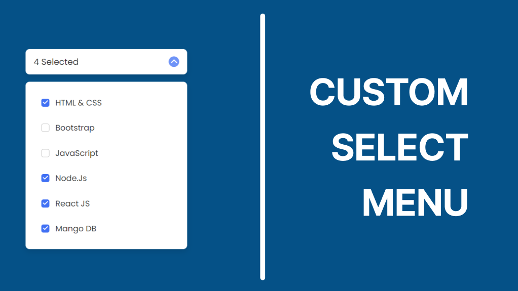
Multiple Options Select Menu is the dropdown menu that contains lots of options and users can select the options that they want. The menu could have a dropdown feature as well. For example, when are going to fill out a registration form on the internet, then we have to click on the choose gender button to select our gender.
Multiple Options Select Menu [Source Code]
To get the following HTML CSS and JavaScript code for the Login & Signup Form you need to create three files one is an HTML file and another is a CSS file and a JavaScript file. After creating these three files then you can copy-paste the given codes on your document. You can also download all source code files from the given download button.
First, paste the following codes into your index.html file.
<!DOCTYPE html>
<!-- Coding By Letscodeweb  -->
<html lang="en">

<head>
    <meta charset="UTF-8">
    <meta http-equiv="X-UA-Compatible" content="IE=edge">
    <meta name="viewport" content="width=device-width, initial-scale=1.0">
    <title> Multiple Options Select Menu </title>

    <!-- CSS -->
    <link rel="stylesheet" href="css/style.css">

    <!-- Fontawesome CDN Link -->
    <link rel="stylesheet" href="https://cdnjs.cloudflare.com/ajax/libs/font-awesome/6.1.1/css/all.min.css">

</head>

<body>
    <div class="container">
        <div class="select-btn">
            <span class="btn-text">Select Language</span>
            <span class="arrow-dwn">
                <i class="fa-solid fa-chevron-down"></i>
            </span>
        </div>

        <ul class="list-items">
            <li class="item">
                <span class="checkbox">
                    <i class="fa-solid fa-check check-icon"></i>
                </span>
                <span class="item-text">HTML & CSS</span>
            </li>
            <li class="item">
                <span class="checkbox">
                    <i class="fa-solid fa-check check-icon"></i>
                </span>
                <span class="item-text">Bootstrap</span>
            </li>
            <li class="item">
                <span class="checkbox">
                    <i class="fa-solid fa-check check-icon"></i>
                </span>
                <span class="item-text">JavaScript</span>
            </li>
            <li class="item">
                <span class="checkbox">
                    <i class="fa-solid fa-check check-icon"></i>
                </span>
                <span class="item-text">Node.Js</span>
            </li>
            <li class="item">
                <span class="checkbox">
                    <i class="fa-solid fa-check check-icon"></i>
                </span>
                <span class="item-text">React JS</span>
            </li>
            <li class="item">
                <span class="checkbox">
                    <i class="fa-solid fa-check check-icon"></i>
                </span>
                <span class="item-text">Mango DB</span>
            </li>
        </ul>
    </div>

    <!-- JavaScript -->
    <script src="js/script.js"></script>
</body>

</html>
Second, paste the following codes into your style.css file.
/* Google Fonts - Poppins */
@import url('https://fonts.googleapis.com/css2?family=Poppins:wght@300;400;500;600&display=swap');

*{
margin: 0;
padding: 0;
box-sizing: border-box;
font-family: 'Poppins', sans-serif;
}
body{
background-color: #e3f2fd;
}
.container{
position: relative;
max-width: 320px;
width: 100%;
margin: 80px auto 30px;
}
.select-btn{
display: flex;
height: 50px;
align-items: center;
justify-content: space-between;
padding: 0 16px;
border-radius: 8px;
cursor: pointer;
background-color: #fff;
box-shadow: 0 5px 10px rgba(0, 0, 0, 0.1);
}
.select-btn .btn-text{
font-size: 17px;
font-weight: 400;
color: #333;
}
.select-btn .arrow-dwn{
display: flex;
height: 21px;
width: 21px;
color: #fff;
font-size: 14px;
border-radius: 50%;
background: #6e93f7;
align-items: center;
justify-content: center;
transition: 0.3s;
}
.select-btn.open .arrow-dwn{
transform: rotate(-180deg);
}
.list-items{
position: relative;
margin-top: 15px;
border-radius: 8px;
padding: 16px;
background-color: #fff;
box-shadow: 0 5px 10px rgba(0, 0, 0, 0.1);
display: none;
}
.select-btn.open ~ .list-items{
display: block;
}
.list-items .item{
display: flex;
align-items: center;
list-style: none;
height: 50px;
cursor: pointer;
transition: 0.3s;
padding: 0 15px;
border-radius: 8px;
}
.list-items .item:hover{
background-color: #e7edfe;
}
.item .item-text{
font-size: 16px;
font-weight: 400;
color: #333;
}
.item .checkbox{
display: flex;
align-items: center;
justify-content: center;
height: 16px;
width: 16px;
border-radius: 4px;
margin-right: 12px;
border: 1.5px solid #c0c0c0;
transition: all 0.3s ease-in-out;
}
.item.checked .checkbox{
background-color: #4070f4;
border-color: #4070f4;
}
.checkbox .check-icon{
color: #fff;
font-size: 11px;
transform: scale(0);
transition: all 0.2s ease-in-out;
}
.item.checked .check-icon{
transform: scale(1);
}
Third, paste the following codes into your script.js file.
const selectBtn = document.querySelector(".select-btn"),
      items = document.querySelectorAll(".item");

selectBtn.addEventListener("click", () => {
    selectBtn.classList.toggle("open");
});

items.forEach(item => {
    item.addEventListener("click", () => {
        item.classList.toggle("checked");

        let checked = document.querySelectorAll(".checked"),
            btnText = document.querySelector(".btn-text");

            if(checked && checked.length > 0){
                btnText.innerText = `${checked.length} Selected`;
            }else{
                btnText.innerText = "Select Language";
            }
    });
})
If you face any difficulties while creating your Custom Dropdown Select Menu or your code is not working as expected, you can download the source code files for this Menu for free by clicking on the download button.

Most Popular

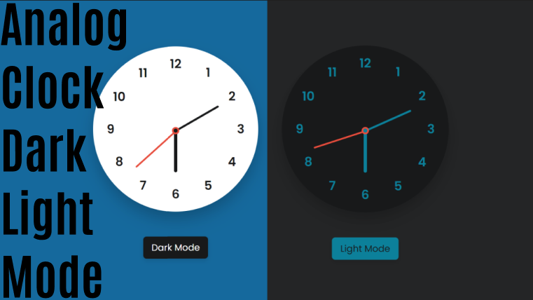
Recent Posts
-
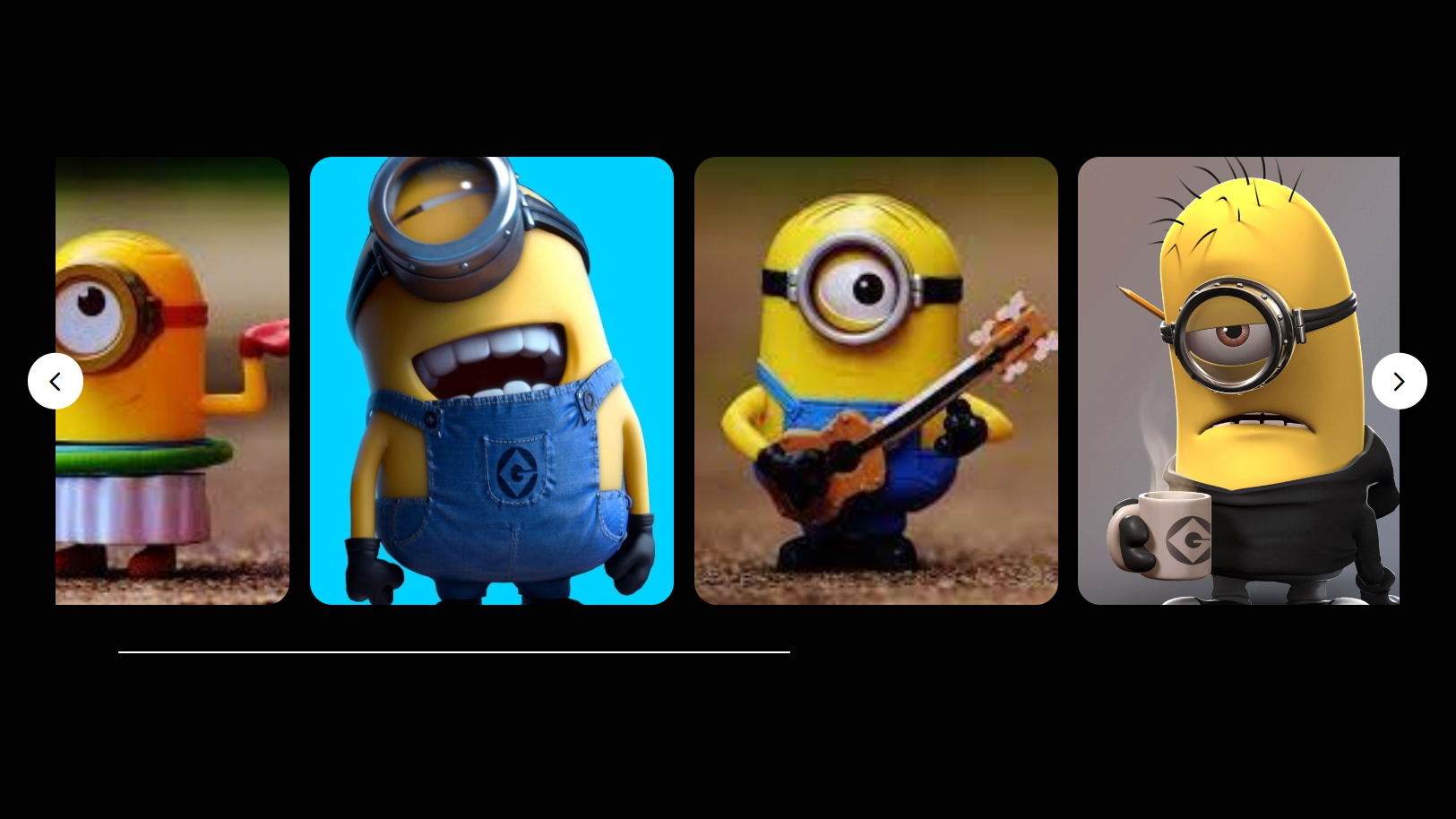
Image Slider in HTML CSS and JavaScript
Letscode - October 4,2023
-
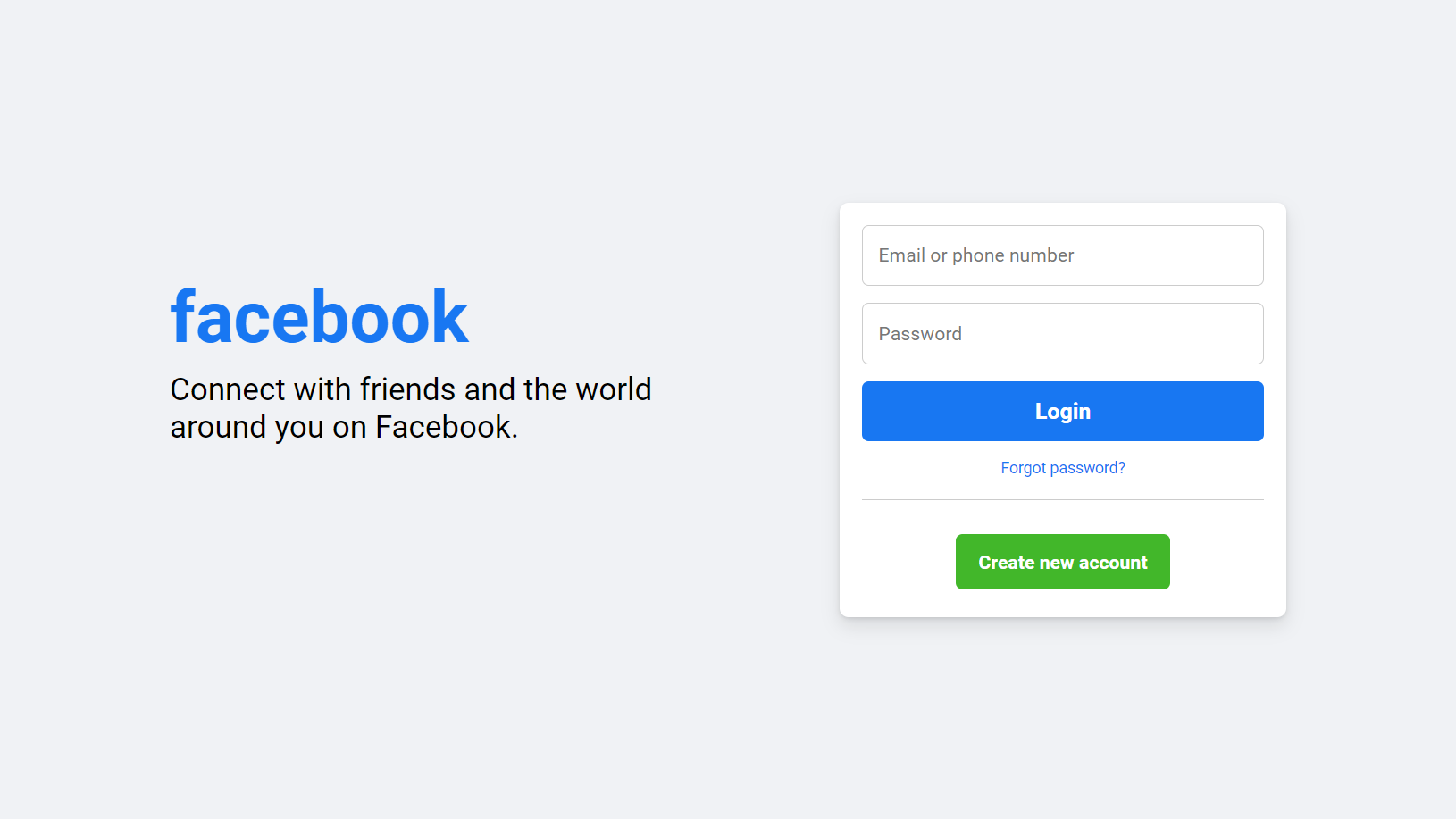
Facebook Login Page Using HTML & CSS
Letscode - October 10,2023
-
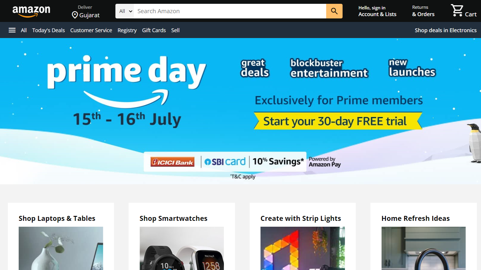
Amazon Website clone in HTML & CSS
Letscode - November 4,2023
-
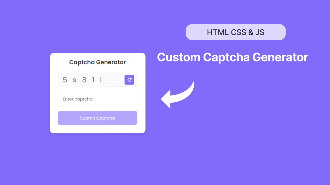
Custom Captcha Generator in HTML CSS and JS
Letscode - October 24,2023