Draggable Slider Tabs in HTML CSS & JavaScript
by Letscode - November 19, 2023
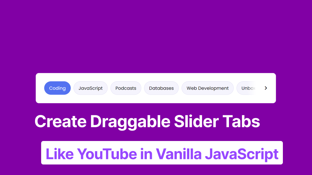
You would have seen the draggable slider tabs on YouTube that filter videos according to the user’s interest. If you’re curious about how to create it with vanilla JavaScript, you can continue reading this blog.
In this blog, you’ll learn how to create Draggable Slider Tabs Like YouTube in HTML CSS & JavaScript. This slider can be a useful UI component for videos, images, and blog sites that needs to filter the content based on the users’ interests.
Have a quick look at the given image of our project [Coming Soon Website] there are some text, time, and an email field and notify me button. In the time section, you can see time on days, hours, minutes, and seconds. Actually, the time will be continuously updated per second.
Steps to Create Draggable Slider Tabs in JavaScript
To create a Draggable Slider Tabs using HTML CSS & JavaScript, follow the given steps line by line:
- Create a folder. You can put any name of this folder and create the below-mentioned files inside this folder.
- Create an index.html file. The file name must be index and its extension .html
- Create a style.css file. The file name must be style and its extension .css
- Create a script.js file. The file name must be script and its extension .js
First, paste the following codes into your index.html file.
<!-- Coding  by Letscode -->
<!DOCTYPE html>
<!-- Coding By letscodeweb - youtube.com/letscodeweb -->
<html lang="en" dir="ltr">
  <head>
    <meta charset="utf-8">
    <title>Draggable Slider Tabs | CodingNepal</title>
    <link rel="stylesheet" href="style.css">
    <meta name="viewport" content="width=device-width, initial-scale=1.0">
    <!-- Font Awesome CDN Link for Icons -->
    <link rel="stylesheet" href="https://cdnjs.cloudflare.com/ajax/libs/font-awesome/6.2.0/css/all.min.css">
    <script src="script.js" defer></script>
  </head>
  <body>
    <div class="wrapper">
      <div class="icon"><i id="left" class="fa-solid fa-angle-left"></i></div>
      <ul class="tabs-box">
        <li class="tab">Coding</li>
        <li class="tab active">JavaScript</li>
        <li class="tab">Podcasts</li>
        <li class="tab">Databases</li>
        <li class="tab">Web Development</li>
        <li class="tab">Unboxing</li>
        <li class="tab">History</li>
        <li class="tab">Programming</li>
        <li class="tab">Gadgets</li>
        <li class="tab">Algorithms</li>
        <li class="tab">Comedy</li>
        <li class="tab">Gaming</li>
        <li class="tab">Share Market</li>
        <li class="tab">Smartphones</li>
        <li class="tab">Data Structure</li>
      </ul>
      <div class="icon"><i id="right" class="fa-solid fa-angle-right"></i></div>
    </div>

  </body>
</html>
Second, paste the following codes into your style.css file.
/* Coding by Letscode */
/* Import Google font - Poppins */
@import url('https://fonts.googleapis.com/css2?family=Poppins:wght@400;500;600&display=swap');
*{
  margin: 0;
  padding: 0;
  box-sizing: border-box;
  font-family: 'Poppins', sans-serif;
}
body {
  display: flex;
  padding: 0 10px;
  align-items: center;
  justify-content: center;
  min-height: 100vh;
  background: #5372F0;
}
.wrapper {
  padding: 35px;
  position: relative;
  overflow-x: hidden;
  max-width: 1000px;
  background: #fff;
  border-radius: 13px;
}
.wrapper .icon {
  position: absolute;
  top: 0;
  height: 100%;
  width: 120px;
  display: flex;
  align-items: center;
}
.icon:first-child {
  left: 0;
  display: none;
  background: linear-gradient(90deg, #fff 70%, transparent);
}
.icon:last-child {
  right: 0;
  justify-content: flex-end;
  background: linear-gradient(-90deg, #fff 70%, transparent);
}
.icon i {
  width: 55px;
  height: 55px;
  cursor: pointer;
  font-size: 1.2rem;
  text-align: center;
  line-height: 55px;
  border-radius: 50%;
}
.icon i:hover {
  background: #efedfb;
}
.icon:first-child i {
  margin-left: 15px;
}
.icon:last-child i {
  margin-right: 15px;
}
.wrapper .tabs-box {
  display: flex;
  gap: 12px;
  list-style: none;
  overflow-x: hidden;
  scroll-behavior: smooth;
}
.tabs-box.dragging {
  scroll-behavior: auto;
  cursor: grab;
}
.tabs-box .tab {
  cursor: pointer;
  font-size: 1.18rem;
  white-space: nowrap;
  background: #f5f4fd;
  padding: 13px 20px;
  border-radius: 30px;
  border: 1px solid #d8d5f2;
}
.tabs-box .tab:hover{
  background: #efedfb;
}
.tabs-box.dragging .tab {
  user-select: none;
  pointer-events: none;
}
.tabs-box .tab.active{
  color: #fff;
  background: #5372F0;
  border-color: transparent;
}
Last, paste the following codes into your script.js file. If you didn’t understand the JavaScript codes, I highly recommend you watch the above YouTube video to understand which line does what.
const tabsBox = document.querySelector(".tabs-box"),
allTabs = tabsBox.querySelectorAll(".tab"),
arrowIcons = document.querySelectorAll(".icon i");

let isDragging = false;

const handleIcons = (scrollVal) => {
    let maxScrollableWidth = tabsBox.scrollWidth - tabsBox.clientWidth;
    arrowIcons[0].parentElement.style.display = scrollVal <= 0 ? "none" : "flex";
    arrowIcons[1].parentElement.style.display = maxScrollableWidth - scrollVal <= 1 ? "none" : "flex";
}

arrowIcons.forEach(icon => {
    icon.addEventListener("click", () => {
        // if clicked icon is left, reduce 350 from tabsBox scrollLeft else add
        let scrollWidth = tabsBox.scrollLeft += icon.id === "left" ? -340 : 340;
        handleIcons(scrollWidth);
    });
});

allTabs.forEach(tab => {
    tab.addEventListener("click", () => {
        tabsBox.querySelector(".active").classList.remove("active");
        tab.classList.add("active");
    });
});

const dragging = (e) => {
    if(!isDragging) return;
    tabsBox.classList.add("dragging");
    tabsBox.scrollLeft -= e.movementX;
    handleIcons(tabsBox.scrollLeft)
}

const dragStop = () => {
    isDragging = false;
    tabsBox.classList.remove("dragging");
}

tabsBox.addEventListener("mousedown", () => isDragging = true);
tabsBox.addEventListener("mousemove", dragging);
document.addEventListener("mouseup", dragStop);
That’s all, now you’ve successfully created a Draggable Slider Tabs Like YouTube in HTML CSS & JavaScript. If your code doesn’t work or you’ve faced any problems, you can download the source code files of this slider tabs from the given download button. It’s free and a zip file will be downloaded that contains the project folder with source code files.

Most Popular

Recent Posts
-
Image Slider in HTML CSS and JavaScript
Letscode - October 4,2023
-
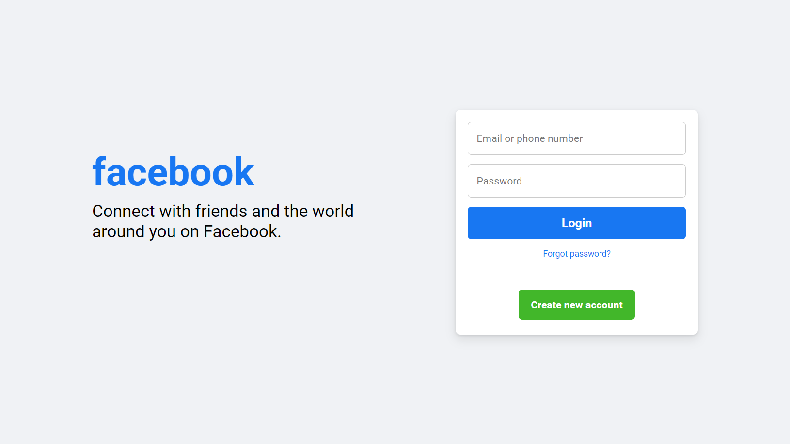
Facebook Login Page Using HTML & CSS
Letscode - October 10,2023
-
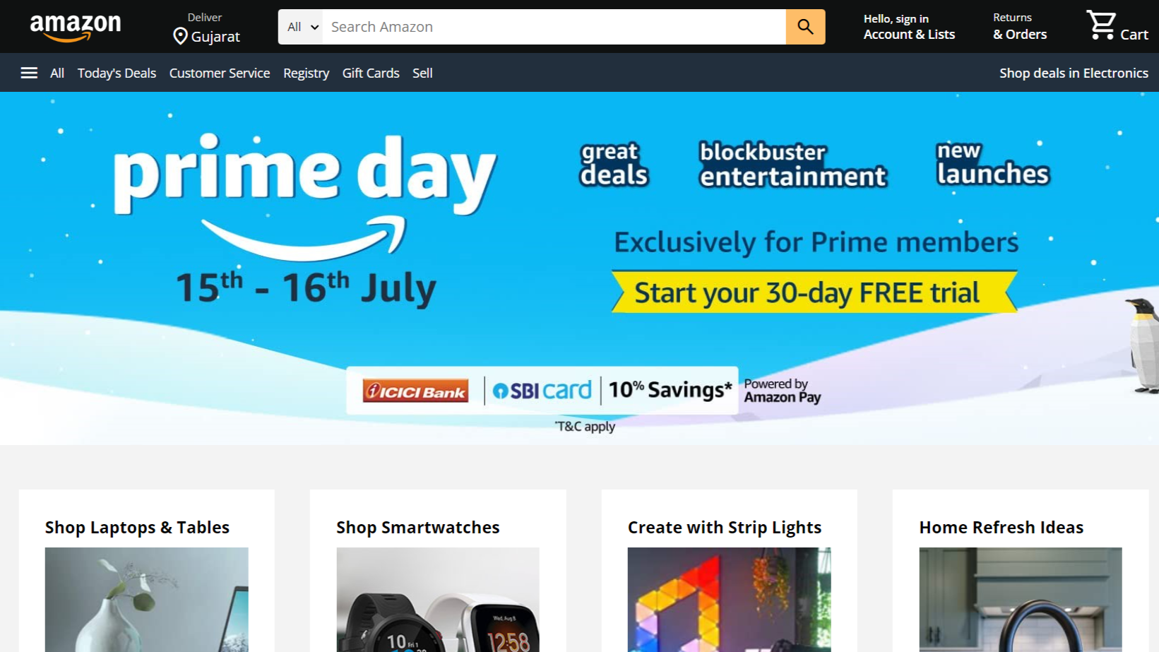
Amazon Website clone in HTML & CSS
Letscode - November 4,2023
-
Custom Captcha Generator in HTML CSS and JS
Letscode - October 24,2023