Elastic Tab Animation using HTML & CSS
by Letscode - december 1,2023
Hello Readers, welcome to my other blog. In this, I will create an Elastic Tab Animation on Navigation Bar with the help of HTML & CSS. Earlier I have shared How to create an Animated Profile card and now, it’s time to create elastic tabs.
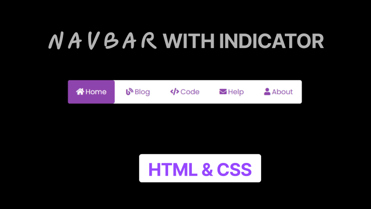
In simple language, elastic tabs mean a specific height and width of hyperlinks where the user clicked to quickly move on a particular webpage within the website. Tabs (hyperlinks) are the most important part of the website to makes user works easier and convenient.
As you can see at a given image on the webpage. There is a horizontal long bar on the webpage, there is a total of five links with different names and their icons. In this program when we hover in those tabs (hyperlinks) light background color appears and when we clicked on a specific tab then right side colored box moves in a tab where we clicked..
Elastic Tab Animation [Source Codes]
Listen, to copy these given codes of this program [Elastic Tab Animation for Navbar], you need to create HTML & CSS files, after creating these two files you can copy-paste the following codes in your HTML CSS files. You can also download all source code files from the given “Download Button”.
<!DOCTYPE html>
<html lang="en" dir="ltr">

<head>
  <meta charset="UTF-8">
  <title> Animated Image Gallery | Letscodeweb </title>
  <link rel="stylesheet" href="style.css">
  <script src="https://kit.fontawesome.com/a076d05399.js"></script>
  <link rel="stylesheet" href="https://cdnjs.cloudflare.com/ajax/libs/font-awesome/5.15.2/css/all.min.css" />

</head>

<body>
  <div class="container">
    <input type="radio" name="s" id="home" checked>
    <input type="radio" name="s" id="blog">
    <input type="radio" name="s" id="code">
    <input type="radio" name="s" id="help">
    <input type="radio" name="s" id="about">
    <nav>
      <div class="slider"></div>
      <label class="home" for="home">
        <i class="fas fa-home"></i>Home
      </label>
      <label class="blog" for="blog">
        <i class="fas fa-blog"></i>Blog
      </label>
      <label class="code" for="code">
        <i class="fas fa-code"></i>Code
      </label>
      <label class="help" for="help">
        <i class="fas fa-envelope"></i>Help
      </label>
      <label class="about" for="about">
        <i class="fas fa-user"></i>About
      </label>
    </nav>
  </div>
</body>

</html>
Second, create a CSS file with the name of style.css and paste the given codes in your CSS file. Remember, you’ve to create a file with .css extension.
@import url('https://fonts.googleapis.com/css2?family=Poppins:wght@200;300;400;500;600;700&display=swap');

* {
  margin: 0;
  padding: 0;
  box-sizing: border-box;
  font-family: 'Poppins', sans-serif;
}

body {
  height: 100vh;
  width: 100%;
  display: flex;
  justify-content: center;
  align-items: center;
  background-color: black;
}

nav {
  width: 600px;
  height: 60px;
  border-radius: 5px;
  display: flex;
  text-align: center;
  position: relative;
  background: #fff;
  box-shadow: 0 5px 10px rgba(0, 0, 0, 0.25);
}

nav label {
  width: 100%;
  height: 100%;
  line-height: 60px;
  font-size: 18px;
  font-weight: 400;
  border-radius: 5px;
  margin: 0 5px;
  color: #8e44ad;
  position: relative;
  z-index: 1;
  cursor: pointer;
  transition: all 0.3s ease;
}

nav label:hover {
  background: rgba(142, 68, 173, 0.3);
}

nav label i {
  margin-right: 4px;
}

nav .slider {
  position: absolute;
  height: 100%;
  width: 20%;
  background: #8e44ad;
  left: 0;
  top: 0;
  border-radius: 5px;
  transition: all 0.4s cubic-bezier(0.68, -0.55, 0.265, 1.55);
  z-index: 1;
}

#home:checked~nav label.home,
#blog:checked~nav label.blog,
#code:checked~nav label.code,
#help:checked~nav label.help,
#about:checked~nav label.about {
  color: #fff;
}

#blog:checked~nav .slider {
  left: 20%;
}

#code:checked~nav .slider {
  left: 40%;
}

#help:checked~nav .slider {
  left: 60%;
}

#about:checked~nav .slider {
  left: 80%;
}

input[type=radio] {
  display: none;
}
That’s all, now you’ve successfully created Social Media Buttons with Tooltip on Hover using only HTML & CSS. If your code doesn’t work or you’ve faced any error/problem then please comment down or contact us from the contact page.

Most Popular
Recent Posts
-
Image Slider in HTML CSS and JavaScript
Letscode - October 4,2023
-
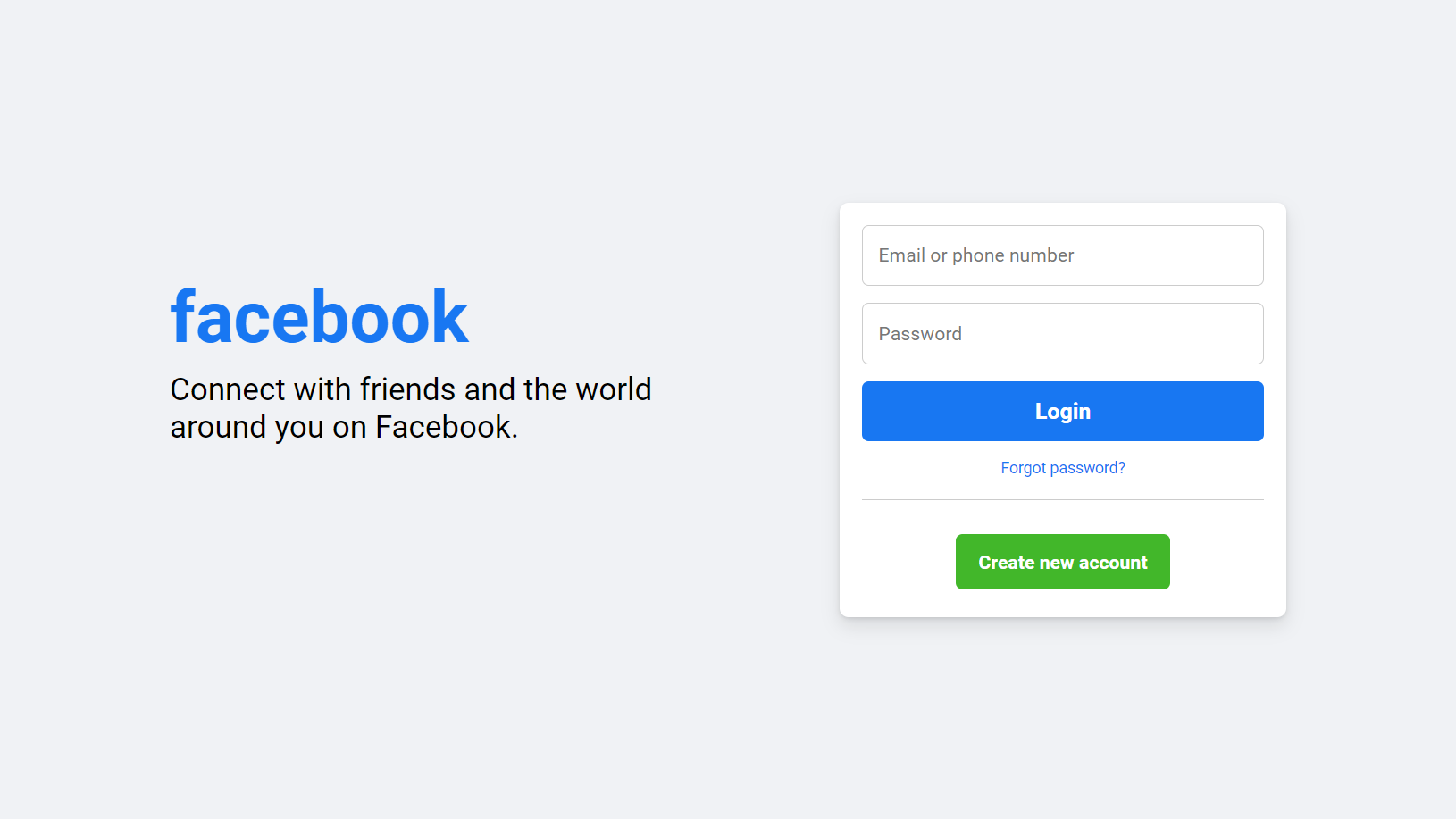
Facebook Login Page Using HTML & CSS
Letscode - October 10,2023
-
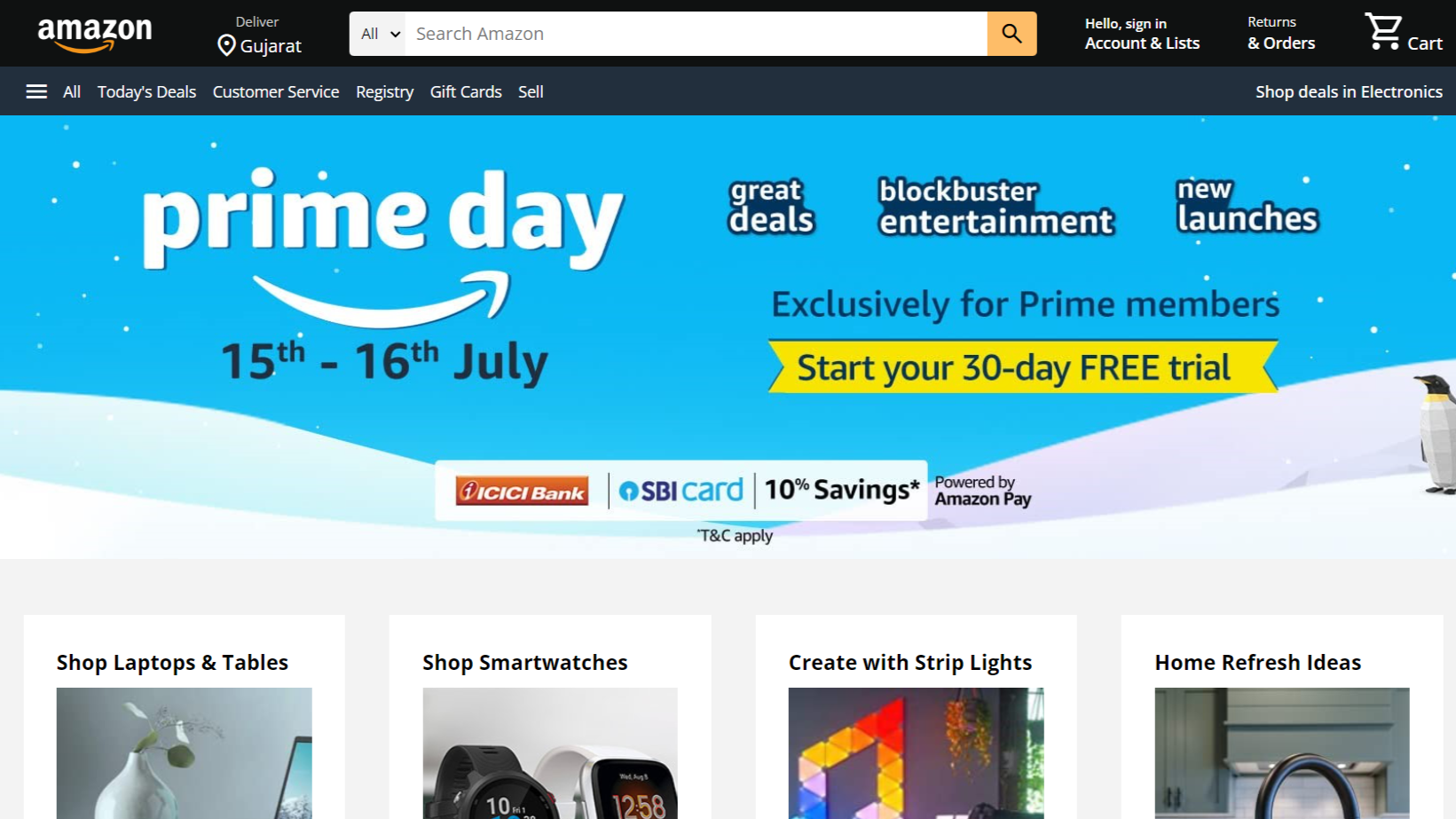
Amazon Website clone in HTML & CSS
Letscode - November 4,2023
-
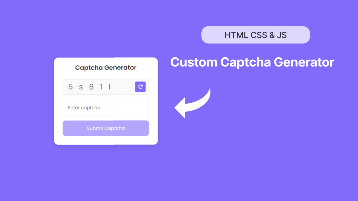
Custom Captcha Generator in HTML CSS and JS
Letscode - October 24,2023