Responsive Masonry Image Gallery with Lightbox in HTML CSS & JavaScript
by Letscode - October 4,2023
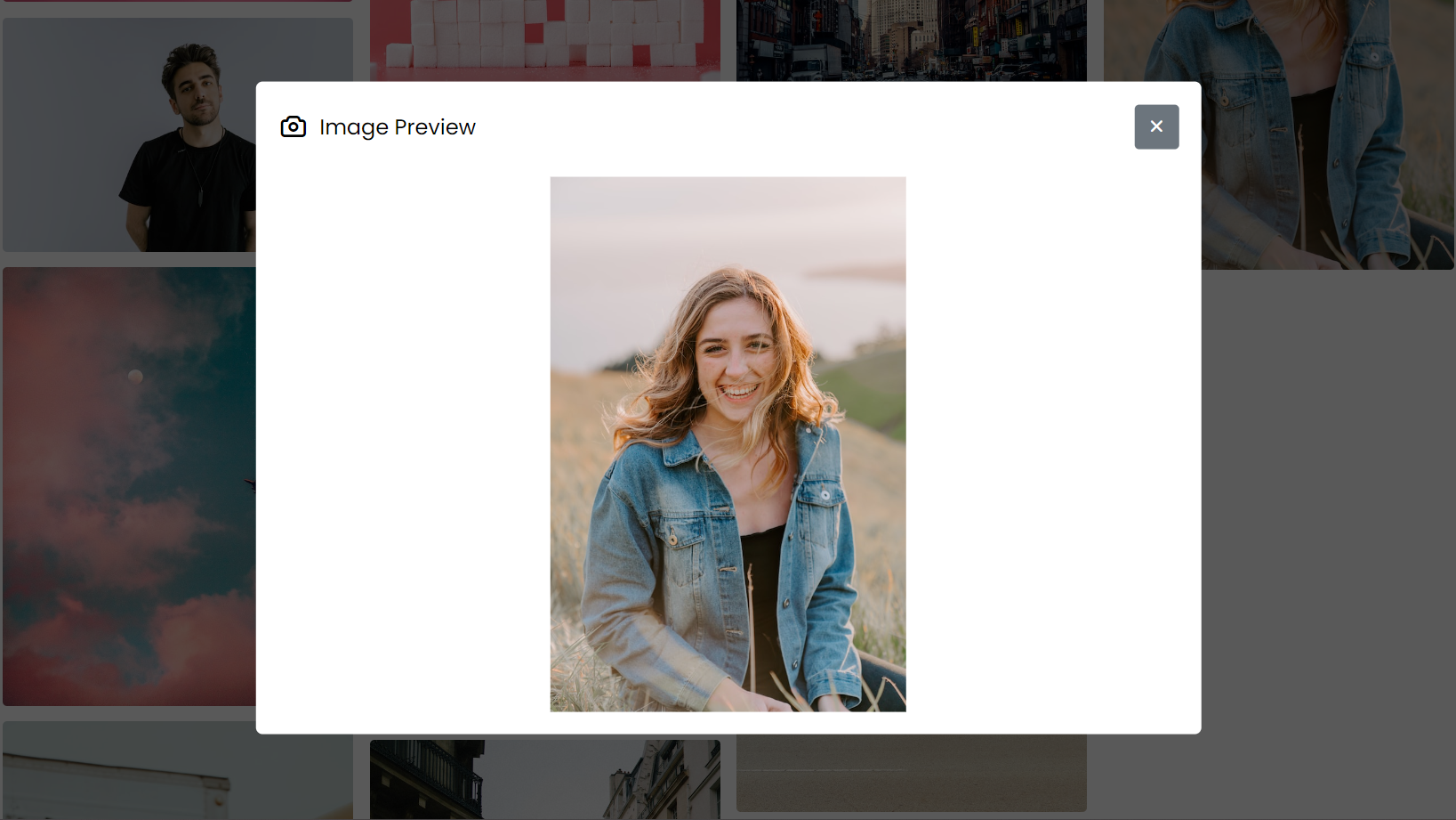
Masonry image galleries are an excellent choice for displaying images on websites because they offer a unique and visually appealing layout. However, adding a lightbox effect to the images makes them even better, as it allows users to view the images in more detail.
In this blog post, I will guide you through creating a Responsive Masonry Image Gallery with a Lightbox Effect. The process is straightforward, and even beginners can follow along with ease. We will use HTML, CSS, and JavaScript to create the gallery and style it, ensuring that it is responsive and works well on various devices.
The gallery’s standout feature is its responsive design, meaning it will look great on any device, from desktops to mobile phones. As you create this image gallery, you will gain valuable knowledge about web development, such as building layouts using HTML, styling elements with CSS and making them responsive, and other essential JavaScript concepts.
Steps To Create Draggable Card Slider in JavaScript
- Create a folder. You can name this folder whatever you want, and inside this folder, create the mentioned files.
- Create an index.html file. The file name must be index and its extension .html
- Create a style.css file. The file name must be style and its extension .css
- Create a script.js file. The file name must be script and its extension .js
- Download the images folder from Google Drive and put this folder inside the project folder. This folder has all the images that will be used for this slider.
To start, add the following HTML codes to your index.html file to create a basic layout for our card slider. This code includes a ul element to hold all of the li elements, which represent each card in the slider. Additionally, the code includes next and previous icons for navigation through the slider.
<!-- Coding By Letscodeweb - youtube.com/Letscodeweb -->
<!DOCTYPE html>
<html lang="en" dir="ltr">
  <head>
    <meta charset="utf-8">
    <title>Masonry Image Gallery with Lightbox | CodingNepal</title>
    <link rel="stylesheet" href="style.css">
    <meta name="viewport" content="width=device-width, initial-scale=1.0">
    <link rel="stylesheet" href="https://unicons.iconscout.com/release/v4.0.0/css/line.css">
    <script src="script.js" defer></script>
  </head>
  <body>
    <h1>Masonry Image Gallery with Lightbox</h1>
    <div class="lightbox">
      <div class="wrapper">
        <header>
          <div class="details">
            <i class="uil uil-camera"></i>
            <span>Image Preview</span>
          </div>
          <div class="buttons"><i class="close-icon uil uil-times"></i></div>
        </header>
        <div class="preview-img">
          <div class="img"><img src="" alt="preview-img"></div>
        </div>
      </div>
    </div>
    <section class="gallery">
      <ul class="images">
        <li class="img"><img src="images/img-1.jpg" alt="img"></li>
        <li class="img"><img src="images/img-2.jpg" alt="img"></li>
        <li class="img"><img src="images/img-3.jpg" alt="img"></li>
        <li class="img"><img src="images/img-4.jpg" alt="img"></li>
        <li class="img"><img src="images/img-5.jpg" alt="img"></li>
        <li class="img"><img src="images/img-6.jpg" alt="img"></li>
        <li class="img"><img src="images/img-7.jpg" alt="img"></li>
        <li class="img"><img src="images/img-8.jpg" alt="img"></li>
        <li class="img"><img src="images/img-9.jpg" alt="img"></li>
        <li class="img"><img src="images/img-10.jpg" alt="img"></li>
        <li class="img"><img src="images/img-11.jpg" alt="img"></li>
      </ul>
    </section>

  </body>
</html>
Next, add the following CSS codes to your style.css file to give a masonry layout for the image gallery and make an image lightbox. Keep in mind that the lightbox is now hidden because I’ve added some CSS properties to hide it. We’ll show it on image click using JavaScript.
/* Import Google font - Poppins */
@import url('https://fonts.googleapis.com/css2?family=Poppins:wght@400;500;600&display=swap');

* {
  margin: 0;
  padding: 0;
  box-sizing: border-box;
  font-family: "Poppins", sans-serif;
}

h1 {
  text-align: center;
  margin-top: 50px;
}

/* Masonry image gallery styling */
.gallery {
  display: flex;
  flex-direction: column;
  align-items: center;
}

.gallery .images {
  gap: 15px;
  max-width: 85%;
  margin: 40px 0;
  columns: 5 310px;
  list-style: none;
}

.gallery .images .img {
  display: flex;
  cursor: pointer;
  overflow: hidden;
  position: relative;
  margin-bottom: 14px;
  border-radius: 4px;
}

.gallery .images img {
  width: 100%;
  transition: transform 0.2s ease;
}

.gallery .images .img:hover img {
  transform: scale(1.1);
}

/* Image lightbox styling */
.lightbox {
  left: 0;
  top: 0;
  width: 100%;
  height: 100%;
  z-index: 5;
  position: fixed;
  visibility: hidden;
  background: rgba(0, 0, 0, 0.65);
}

.lightbox.show {
  visibility: visible;
}

.lightbox .wrapper {
  position: fixed;
  left: 50%;
  top: 50%;
  width: 100%;
  padding: 20px;
  max-width: 850px;
  background: #fff;
  border-radius: 6px;
  opacity: 0;
  pointer-events: none;
  transform: translate(-50%, -50%) scale(0.9);
  transition: transform 0.1s ease;
}

.lightbox.show .wrapper {
  opacity: 1;
  pointer-events: auto;
  transform: translate(-50%, -50%) scale(1);
}

.wrapper :where(header, .details) {
  display: flex;
  align-items: center;
}

.wrapper header {
  justify-content: space-between;
}

header .details i {
  font-size: 1.7rem;
}

header .details span {
  font-size: 1.2rem;
  margin-left: 10px;
}

header .buttons i {
  height: 40px;
  width: 40px;
  cursor: pointer;
  display: inline-block;
  color: #fff;
  margin-left: 10px;
  background: #6C757D;
  font-size: 1.25rem;
  line-height: 40px;
  text-align: center;
  border-radius: 4px;
  transition: 0.2s ease;
}

header .buttons i:hover {
  background: #5f666d;
}

.wrapper .preview-img {
  display: flex;
  justify-content: center;
  margin-top: 25px;
}

.preview-img .img {
  max-height: 65vh;
}

.preview-img img {
  width: 100%;
  height: 100%;
  object-fit: contain;
}

/* Responsive media query code */
@media screen and (max-width: 688px) {
  .lightbox .wrapper {
    padding: 12px;
    max-width: calc(100% - 26px);
  }

  .wrapper .preview-img {
    margin-top: 15px;
  }

  .gallery .images {
    max-width: 100%;
    padding: 0 13px;
    margin-top: 20px;
  }
}
Finally, add the following JavaScript code to your script.js file to show a lightbox when the user clicks on the specific image and then hide the lightbox when they click on the close icon.
const allImages = document.querySelectorAll(".images .img");
const lightbox = document.querySelector(".lightbox");
const closeImgBtn = lightbox.querySelector(".close-icon");

allImages.forEach(img => {
    // Calling showLightBox function with passing clicked img src as argument
    img.addEventListener("click", () => showLightbox(img.querySelector("img").src));
});

const showLightbox = (img) => {
    // Showing lightbox and updating img source
    lightbox.querySelector("img").src = img;
    lightbox.classList.add("show");
    document.body.style.overflow = "hidden";
}

closeImgBtn.addEventListener("click", () => {
    // Hiding lightbox on close icon click
    lightbox.classList.remove("show");
    document.body.style.overflow = "auto";
});
In short, we started by creating a simple unordered list structure of images, styling it using CSS to create a masonry layout, and adding a div with the class “lightbox” to contain the image preview and close button. Finally, we added JavaScript code to show and hide the lightbox as needed.
Conclusion and Final Words
By following the steps in this blog post, I hope you were able to create a masonry image gallery with a lightbox effect using HTML, CSS, and JavaScript. The code and logic behind creating this image gallery were quite simple and easy to follow.
If you’re eager to enhance your web development skills further, why not explore our blog on Creating a Functional Image Gallery in HTML, CSS, and JavaScript? This informative post guides you through the process of creating an image gallery that lets users search for, view, and download images.
If you encounter any problems or your code is not working as expected, you can download the source code files for this masonry image gallery for free. Click on the download button to get the zip file containing the project folder with source code files and images.

Most Popular


Recent Posts
-
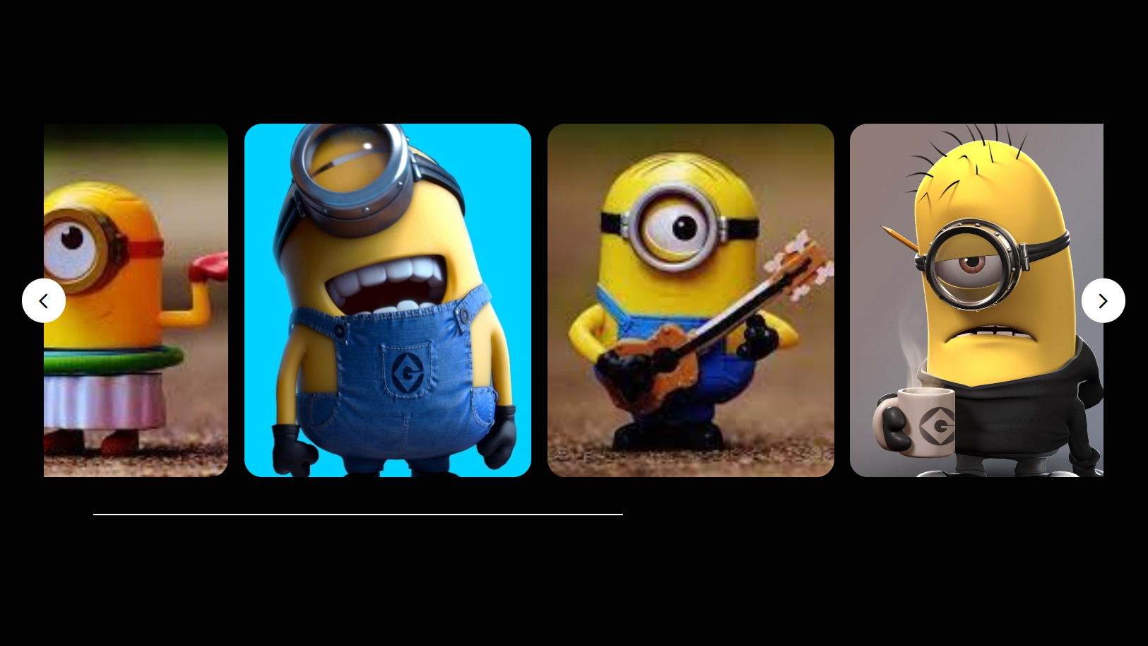
Image Slider in HTML CSS and JavaScript
Letscode - October 4,2023
-

Facebook Login Page Using HTML & CSS
Letscode - October 10,2023
-

Amazon Website clone in HTML & CSS
Letscode - November 4,2023
-
Custom Captcha Generator in HTML CSS and JS
Letscode - October 24,2023