Multi Step Progress Bar in HTML CSS & JavaScript
by Letscode - October 4,2023
The multi-step process enhances the user experience by dividing the registration process into smaller, more manageable steps. This reduces confusion and frustration for the user, as clear and concise guidance is provided throughout the process.
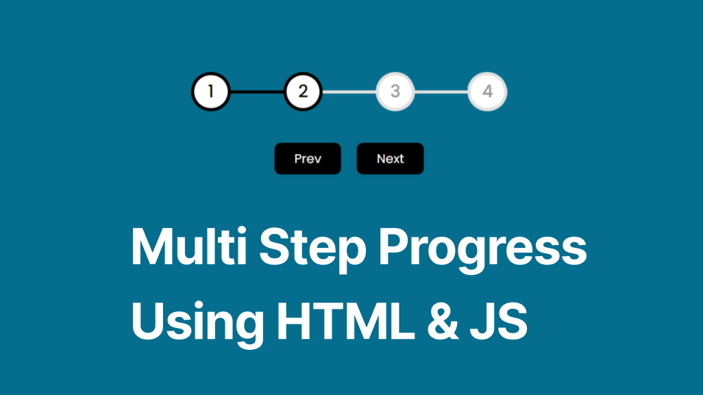
In this blog, you will learn how to create a Multi-Step Progress Bar using HTML CSS & JavaScript. As you can see in the image there will be a total of four steps and two buttons to control that multistep progress bar. Additionally, recently I thought to create Neumorphism Loading Animation, you may like that as well.
By the end of this blog post, you will have a Multi-Step Progress Bar. And, you can implement it in various sections like Registration or signup form.
Steps to create Multi Step Progress Bar in HTML CSS & JS
We will create this multistep progress bar in HTML CSS and JavaScript.
1. File Structure
In the initial step, we will create a new directory for our project. You can name it whatever you want, and inside this directory, create two files: index.html and style.css. These files will contain the necessary HTML and CSS code for the card slider.
2. Creating the Multi-Step Progress Bar
In the second step, we will create the layout and style the progress bar & buttons using HTML and CSS. In your index.html file, add the following HTML code to create the basic structure of the multi-step progress bar.
<!DOCTYPE html>
<!-- Coding by Letscodeweb -->
<html lang="en">m

<head>
    <meta charset="UTF-8" />
    <meta http-equiv="X-UA-Compatible" content="IE=edge" />
    <meta name="viewport" content="width=device-width, initial-scale=1.0" />
    <title>Multi Step Progress</title>
    <link rel="stylesheet" href="style.css" />
    <script src="script.js" defer></script>
</head>

<body>
    <div class="container">
        <div class="steps">
            <span class="circle active">1</span>
            <span class="circle">2</span>
            <span class="circle">3</span>
            <span class="circle">4</span>
            <div class="progress-bar">
                <span class="indicator"></span>
            </div>
        </div>
        <div class="buttons">
            <button id="prev" disabled>Prev</button>
            <button id="next">Next</button>
        </div>
    </div>
</body>

</html>
Second, paste the following codes into your style.css file.
/* Import Google font - Poppins */
@import url("https://fonts.googleapis.com/css2?family=Poppins:wght@200;300;400;500;600;700&display=swap");

* {
  margin: 0;
  padding: 0;
  box-sizing: border-box;
  font-family: "Poppins", sans-serif;
}

body {
  height: 100vh;
  display: flex;
  align-items: center;
  justify-content: center;
  background: #056e8e;
}

.container {
  display: flex;
  flex-direction: column;
  align-items: center;
  gap: 40px;
  max-width: 400px;
  width: 100%;
}

.container .steps {
  display: flex;
  width: 100%;
  align-items: center;
  justify-content: space-between;
  position: relative;
}

.steps .circle {
  display: flex;
  align-items: center;
  justify-content: center;
  height: 50px;
  width: 50px;
  color: #999;
  font-size: 22px;
  font-weight: 500;
  border-radius: 50%;
  background: #fff;
  border: 4px solid #e0e0e0;
  transition: all 200ms ease;
  transition-delay: 0s;
}

.steps .circle.active {
  transition-delay: 100ms;
  border-color: #000;
  color: #000;
}

.steps .progress-bar {
  position: absolute;
  height: 4px;
  width: 100%;
  background: #e0e0e0;
  z-index: -1;
}

.progress-bar .indicator {
  position: absolute;
  height: 100%;
  width: 0%;
  background: #000;
  transition: all 300ms ease;
}

.container .buttons {
  display: flex;
  gap: 20px;
}

.buttons button {
  padding: 8px 25px;
  background: #000;
  border: none;
  border-radius: 8px;
  color: #fff;
  font-size: 16px;
  font-weight: 400;
  cursor: pointer;
  box-shadow: 0 5px 10px rgba(0, 0, 0, 0.05);
  transition: all 200ms linear;
}

.buttons button:active {
  transform: scale(0.97);
}

.buttons button:disabled {
  background: #87a5f8;
  cursor: not-allowed;
}
Third, paste the following codes into your script.js file.
//DOM Elements
const circles = document.querySelectorAll(".circle"),
  progressBar = document.querySelector(".indicator"),
  buttons = document.querySelectorAll("button");

let currentStep = 1;

// function that updates the current step and updates the DOM
const updateSteps = (e) => {
  // update current step based on the button clicked
  currentStep = e.target.id === "next" ? ++currentStep : --currentStep;

  // loop through all circles and add/remove "active" class based on their index and current step
  circles.forEach((circle, index) => {
    circle.classList[`${index < currentStep ? "add" : "remove"}`]("active");
  });

  // update progress bar width based on current step
  progressBar.style.width = `${((currentStep - 1) / (circles.length - 1)) * 100}%`;

  // check if current step is last step or first step and disable corresponding buttons
  if (currentStep === circles.length) {
    buttons[1].disabled = true;
  } else if (currentStep === 1) {
    buttons[0].disabled = true;
  } else {
    buttons.forEach((button) => (button.disabled = false));
  }
};

// add click event listeners to all buttons
buttons.forEach((button) => {
  button.addEventListener("click", updateSteps);
});
Conclusion and Final Words
By following the steps in this blog post, you have successfully created a Multi-Step Progress Bar using HTML, CSS, and JavaScript. Now it’s up to you to experiment with the code and make it more useful.
If you encounter any problems or your code is not working as expected, you can download the source code files of this Multi Step Progress Bar project by clicking on the given download button. It’s free, and a zip file will be downloaded that contains the project folder with source code files.

Most Popular


Recent Posts
-
Image Slider in HTML CSS and JavaScript
Letscode - October 4,2023
-

Facebook Login Page Using HTML & CSS
Letscode - October 10,2023
-

Amazon Website clone in HTML & CSS
Letscode - November 4,2023
-
Custom Captcha Generator in HTML CSS and JS
Letscode - October 24,2023