Neumorphism Login Form UI Design using HTML & CSS
by Letscode - October 4,2023
Hello readers, Today in this blog you’ll learn how to create a Neumorphism Login Form Design in HTML & CSS. Earlier I have shared an Animated Glowing Inputs Border Login Form Design using only HTML & CSS, now it’s time to create a Neumorphism Login Form UI Design in HTML & CSS.
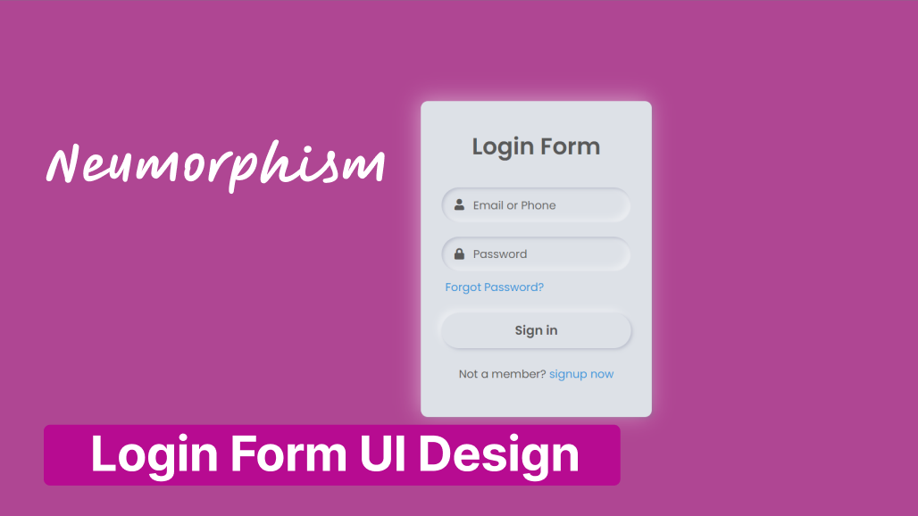
The Neomorphism effect is a mixture of the current famous flat UI and the old skeuomorphic principles! The parts have a dark box-shadow on the bottom and a light box-shadow on top; the combination of both creates the effect of the elements pushing themselves through your display.
As you can see in the image, this is a Light Neumorphism Login Form created using only HTML & CSS. Basically, In our Light Neumorphism Login, there are some icons like user and password. This Login Form is created only for design purposes.
If you’re feeling difficult to understand what I am saying. You can watch a full video tutorial on this program (Neumorphism Login Form UI Design).
Neumorphism Login Form in HTML & CSS [Source Codes]
To create this Neumorphism Login Form Design. First, you need to create two Files one HTML File and another one is CSS File. After creating these files just paste the following codes in your file. First, create an HTML file with the name of index.html and paste the given codes in your HTML file. Remember, you’ve to create a file with .html extension.
<!DOCTYPE html>
<!-- Created By Letscodeweb -->
<html lang="en" dir="ltr">

<head>
    <meta charset="utf-8">
    <title>Neumorphism Login Form UI | Letscodeweb</title>
    <link rel="stylesheet" href="style.css">
    <link rel="stylesheet" href="https://cdnjs.cloudflare.com/ajax/libs/font-awesome/5.15.3/css/all.min.css" />
</head>

<body>
    <div class="content">
        <div class="text">
            Login Form
        </div>
        <form action="#">
            <div class="field">
                <input type="text" required>
                <span class="fas fa-user"></span>
                <label>Email or Phone</label>
            </div>
            <div class="field">
                <input type="password" required>
                <span class="fas fa-lock"></span>
                <label>Password</label>
            </div>
            <div class="forgot-pass">
                <a href="#">Forgot Password?</a>
            </div>
            <button>Sign in</button>
            <div class="sign-up">
                Not a member?
                <a href="#">signup now</a>
            </div>
        </form>
    </div>
</body>

</html>
Second, create a CSS file with the name of style.css and paste the given codes in your CSS file. Remember, you’ve to create a file with .css extension.
@import url('https://fonts.googleapis.com/css?family=Poppins:400,500,600,700&display=swap');
*{
  margin: 0;
  padding: 0;
  /* user-select: none; */
  box-sizing: border-box;
  font-family: 'Poppins', sans-serif;
}
html,body{
  height: 100%;
}
body{
  display: grid;
  place-items: center;
  background: #dde1e7;
  text-align: center;
}
.content{
  width: 330px;
  padding: 40px 30px;
  background: #dde1e7;
  border-radius: 10px;
  box-shadow: -3px -3px 7px #ffffff73,
               2px 2px 5px rgba(94,104,121,0.288);
}
.content .text{
  font-size: 33px;
  font-weight: 600;
  margin-bottom: 35px;
  color: #595959;
}
.field{
  height: 50px;
  width: 100%;
  display: flex;
  position: relative;
}
.field:nth-child(2){
  margin-top: 20px;
}
.field input{
  height: 100%;
  width: 100%;
  padding-left: 45px;
  outline: none;
  border: none;
  font-size: 18px;
  background: #dde1e7;
  color: #595959;
  border-radius: 25px;
  box-shadow: inset 2px 2px 5px #BABECC,
              inset -5px -5px 10px #ffffff73;
}
.field input:focus{
  box-shadow: inset 1px 1px 2px #BABECC,
              inset -1px -1px 2px #ffffff73;
}
.field span{
  position: absolute;
  color: #595959;
  width: 50px;
  line-height: 50px;
}
.field label{
  position: absolute;
  top: 50%;
  transform: translateY(-50%);
  left: 45px;
  pointer-events: none;
  color: #666666;
}
.field input:valid ~ label{
  opacity: 0;
}
.forgot-pass{
  text-align: left;
  margin: 10px 0 10px 5px;
}
.forgot-pass a{
  font-size: 16px;
  color: #3498db;
  text-decoration: none;
}
.forgot-pass:hover a{
  text-decoration: underline;
}
button{
  margin: 15px 0;
  width: 100%;
  height: 50px;
  font-size: 18px;
  line-height: 50px;
  font-weight: 600;
  background: #dde1e7;
  border-radius: 25px;
  border: none;
  outline: none;
  cursor: pointer;
  color: #595959;
  box-shadow: 2px 2px 5px #BABECC,
             -5px -5px 10px #ffffff73;
}
button:focus{
  color: #3498db;
  box-shadow: inset 2px 2px 5px #BABECC,
             inset -5px -5px 10px #ffffff73;
}
.sign-up{
  margin: 10px 0;
  color: #595959;
  font-size: 16px;
}
.sign-up a{
  color: #3498db;
  text-decoration: none;
}
.sign-up a:hover{
  text-decoration: underline;
}
That’s all, now you’ve successfully created a Neumorphism Login Form UI Design using HTML & CSS. If your code does not work or you’ve faced any error/problem then please comment down or contact us from the contact page.

Most Popular


Recent Posts
-
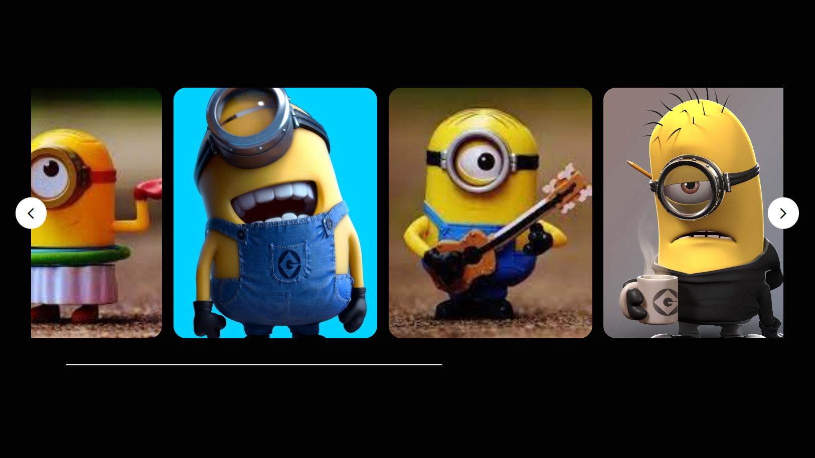
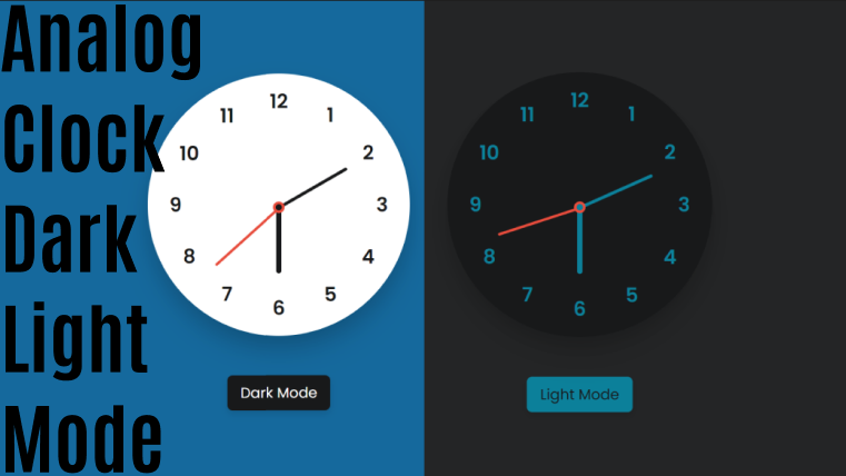
Image Slider in HTML CSS and JavaScript
Letscode - October 4,2023
-
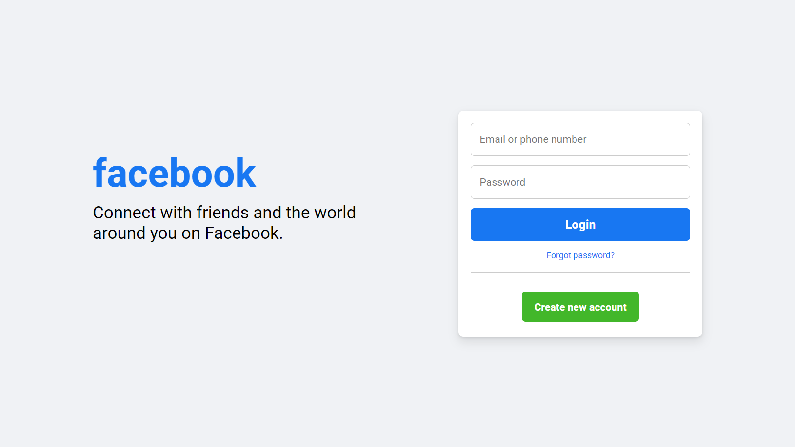
Facebook Login Page Using HTML & CSS
Letscode - October 10,2023
-

Amazon Website clone in HTML & CSS
Letscode - November 4,2023
-
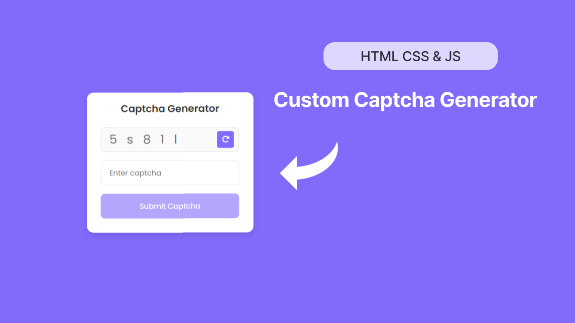
Custom Captcha Generator in HTML CSS and JS
Letscode - October 24,2023