Animated Share Button using only HTML & CSS
by Letscode - October 4,2023
Hello readers, welcome to my other blog, today in this blog I’m going to create an Animated Share Button with help of HTML & CSS only. In a previous blog, I have shared How to Create a Website in HTML & CSS and I’m going to create an animated share button.
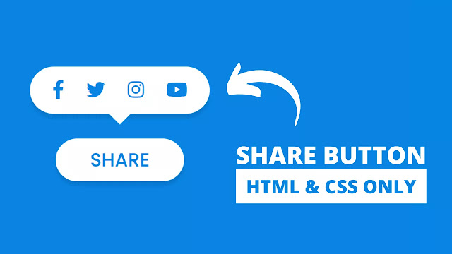
Simply we can understand that share button means a button on the screen which help user to send images, videos, music to the friends through the social media. There may be any social media like Facebook, Twitter, Instagram, YouTube, and others. Nowadays share buttons are used the maximum website and mobile app to make user’s sharing convenient.
As you can see on the given image of the share button with social media icons on the webpage. Actually, in the first in this program[Animated Share Button], there is only one button on the screen, when that button is clicked upper tooltip appears with these four social media icons with smooth sliding animation from top to button which really awesome. When this social media button hovered three colors are changed into the original color and these icons move a little upside.
If you are feeling difficulties understanding that what I’m saying, you can watch a full video tutorial of this program[Share Button Animation with Social Media Icons], which is given below.
Animated Share button [Source Codes]
To paste the given codes of this program [ Animated Share Button Design], first of all, you need to create two files one is an HTML file and another is a CSS file. After creating these two files you can easily copy-paste the given codes in your HTML & CSS files. You can also download all source code files directly from the given “Download Button”.
<!DOCTYPE html>
<!-- Created By letscodeweb -->
<html lang="en" dir="ltr">
  <head>
    <meta charset="UTF-8">
    <title> Animated Share Button | letscodeweb </title>
    <link rel="stylesheet" href="style.css">
        <link rel="stylesheet" href="https://cdnjs.cloudflare.com/ajax/libs/font-awesome/5.15.3/css/all.min.css">
   </head>
<body>
<div class="mainbox">
  <input type="checkbox" id="check">
  <label for="check">Share</label>
  <div class="media-icons">
    <a href="#"><i class="fab fa-facebook"></i></a>
    <a href="#"><i class="fab fa-twitter"></i></a>
    <a href="#"><i class="fab fa-instagram"></i></a>
    <a href="#"><i class="fab fa-youtube"></i></a>
  </div>
</div>
</body>
</html>
/* Coding by Letscode */
@import url('https://fonts.googleapis.com/css2?family=Poppins:wght@200;300;400;500;600;700&display=swap');
*{
  margin: 0;
  padding: 0;
  box-sizing: border-box;
  font-family: 'Poppins',sans-serif;
}
body{
  background: #0984e3
}
.mainbox{
  position: absolute;
  left: 50%;
  top: 60%;
  transform: translate(-50%, -50%);
}
label{
  position: relative;
  background: #fff;
  height: 50px;
  width: 150px;
  border-radius: 35px;
  line-height: 50px;
  text-align: center;
  font-size: 22px;
  font-weight: 500;
  text-transform: uppercase;
  display: block;
  color: #0984e3;
  cursor: pointer;
  box-shadow: 0 0 4px rgba(0, 0, 0, 0.5);
  transition: all 0.3s ease;
}
label:hover{
letter-spacing: 1px;
}
label::before{
  content: 'Cancel';
  position: absolute;
  height: 100%;
  width: 100%;
  left: 0;
  top: 0;
  background: #fff;
  border-radius: 35px;
  opacity: 0;
}
#check{
  display: none;
}
#check:checked ~ label::before{
  opacity: 1;
}
.media-icons{
  position: absolute;
  left: 50%;
  top: -120px;
  transform: translateX(-50%);
  background: #fff;
  width: 140%;
  height: 110%;
  text-align: center;
  display: flex;
  align-items: center;
  justify-content: space-evenly;
  border-radius: 35px;
  padding: 4px;
  z-index: 1;
  opacity: 0;
  pointer-events: none;
  box-shadow: 0 0 4px rgba(0, 0, 0, 0.5);
  transition: all 0.3s ease;
}
#check:checked ~ .media-icons{
  opacity: 1;
  pointer-events: auto;
  top: -84px;
}
.media-icons::before{
  content: '';
  width: 18px;
  height: 18px;
  position: absolute;
  left: 50%;
  background: #fff;
  bottom: -9px;
  transform: translateX(-50%) rotate(45deg);
  z-index: -1;
}
.media-icons a{
  font-size: 22px;
  color: #0984e3;
  transition: all 0.3s ease;
}
.media-icons a:hover{
  transform: translateY(-2px);
}
.media-icons a:nth-child(1):hover{
  color: #426782;
}
.media-icons a:nth-child(2):hover{
  color: #1da1f2;
}
.media-icons a:nth-child(3):hover{
  color: #e1306c;
}
.media-icons a:nth-child(4):hover{
  color: #ff0000;
}
If you face any difficulties while creating your Share Button or your code is not working as expected, you can download the source code files for this Animated Share Button for free by clicking on the download button, and you can also view a live demo of this card slider by clicking on the view live button.

Most Popular
Recent Posts
-
Image Slider in HTML CSS and JavaScript
Letscode - October 4,2023
-
Facebook Login Page Using HTML & CSS
Letscode - October 10,2023
-
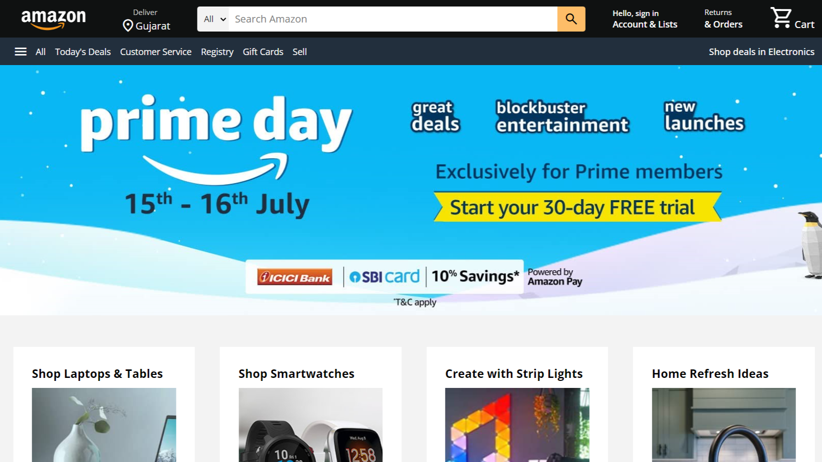
Amazon Website clone in HTML & CSS
Letscode - November 4,2023
-
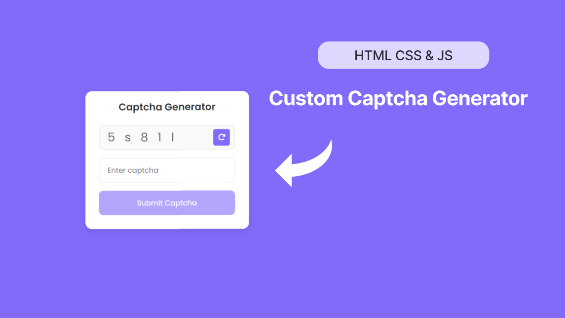
Custom Captcha Generator in HTML CSS and JS
Letscode - October 24,2023