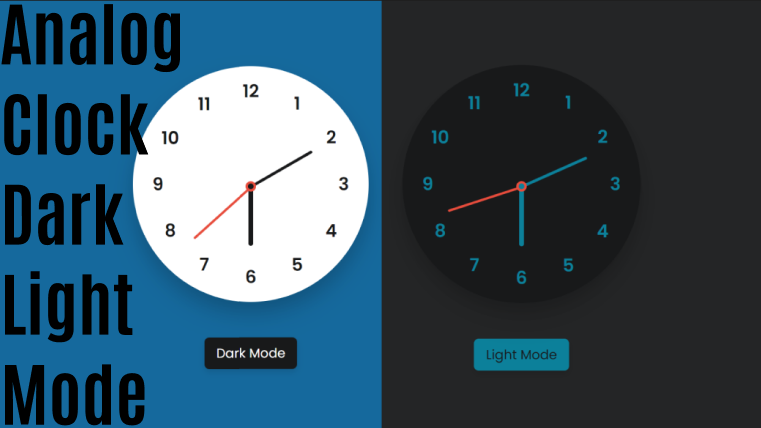
Multiple Typing Text Animation in HTML CSS & JavaScript
by Letscode - October 4,2023
Hello friend, hope you are doing awesome. Today in this blog you will learn to create Multiple Typing Text Animation using HTML CSS and JavaScript. I also have created a Website with Typing Text Effect.
Multiple typing text animation means the animation of the text that changes automatically like the typewriter effect. This typing text effect is going very famous nowadays. We can see this type of effect on website manly.
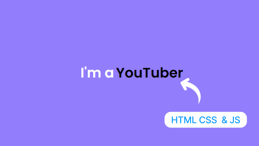
Let’s have a quick look at the given image of our project [Multiple Typing Text Animation]. In the image, we can see white text and blue text with the incomplete word. Actually, the with parts of the text will be constant and the blue part words will be animated with multiple texts.
To see the real demo of this multiple typing text animation and the HTML CSS and JavaScript code that I have used to create this project, you can watch the video tutorial of this project, which is given below.
Multiple Typing Text [Source Code]
To get the following HTML CSS and JavaScript code for the Multiple Typing Text Animation, you need to create two files one is an HTML file and another is a CSS file. After creating these two files then you can copy-paste the given codes on your document. You can also download all source code files from the given download button.
<!DOCTYPE html>
<!--=== Coding by Letscode -->
<html lang="en">

<head>
    <meta charset="UTF-8">
    <meta http-equiv="X-UA-Compatible" content="IE=edge">
    <meta name="viewport" content="width=device-width, initial-scale=1.0">
    <link rel="stylesheet" href="style.css">
    <title>Typing Text Animation - Letscode</title>
</head>

<body>
    <div class="container">
        <span class="text first-text">I'm a</span>
        <span class="text sec-text">Freelancer</span>
    </div>
</body>
</html>
/* Coding by Letscode */
/* ===== Google Font Import - Poppins ===== */
@import url('https://fonts.googleapis.com/css2?family=Poppins:wght@200;300;400;500;600&display=swap');

* {
    margin: 0;
    padding: 0;
    box-sizing: border-box;
    font-family: 'Poppins', sans-serif;
}

body {
    min-height: 100vh;
    display: flex;
    align-items: center;
    justify-content: center;
    background: #927dfc;
    overflow: hidden;
}

.container {
    width: 246px;
    overflow: hidden;
}

.container .text {
    position: relative;
    color: #000;
    font-size: 30px;
    font-weight: 600;
}

.container .text.first-text {
    color: #FFF;
}

.text.sec-text:before {
    content: "";
    position: absolute;
    top: 0;
    left: 0;
    height: 100%;
    width: 100%;
    background-color: #927dfc;
    border-left: 2px solid #927dfc;
    animation: animate 4s steps(12) infinite;
}

@keyframes animate {

    40%,
    60% {
        left: calc(100% + 4px);
    }

    100% {
        left: 0%;
    }
}
// Javascript Code
const text = document.querySelector(".sec-text");
const textLoad = () => {
    setTimeout(() => {
        text.textContent = "Freelancer";
    }, 0);
    setTimeout(() => {
        text.textContent = "Blogger";
    }, 4000);
    setTimeout(() => {
        text.textContent = "YouTuber";
    }, 8000); //1s = 1000 milliseconds
    setTimeout(() => {
        text.textContent = "Gamer";
    }, 12000); //1s = 1000 milliseconds
    setTimeout(() => {
        text.textContent = "Coder";
    }, 16000); //1s = 1000 milliseconds
}
textLoad();
setInterval(textLoad, 24000);

Most Popular

Recent Posts
-
Image Slider in HTML CSS and JavaScript
Letscode - October 4,2023
-
Facebook Login Page Using HTML & CSS
Letscode - October 10,2023
-
Amazon Website clone in HTML & CSS
Letscode - November 4,2023
-
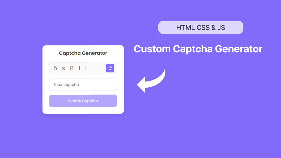
Custom Captcha Generator in HTML CSS and JS
Letscode - October 24,2023